
Luxury packaging is high-quality packaging designed to increase perceived value before the product is used. It combines refined materials, precise structure, elegant finishes, craftsmanship, sensory details and controlled presentation to make the product feel more desirable, exclusive and memorable. Unlike standard packaging, it is judged not only by function, but by how it shapes perception before, during and after opening.
To understand why some packaging feels premium while other packaging feels ordinary or cheap, it helps to look at the psychological, sensory, material and visual cues that shape luxury perception.
In premium categories, packaging does far more than protect the product or make it easier to transport. It introduces the product, frames its value and influences how it is understood before it is opened or used. In luxury, that role becomes especially important because packaging is often part of what the customer is paying for.
Luxury packaging is packaging designed to make a product feel more refined, desirable and distinctive through the way it looks, feels and presents the brand. It combines material quality, structure, finishing, weight, proportion, typography, sensory detail and controlled presentation to create a stronger perception of value. The goal is not only to hold the product, but to make the product feel worth attention.
This is one of the main differences between standard packaging and luxury packaging. Standard packaging is usually judged by function, efficiency, protection and visibility. Luxury packaging still needs to perform those tasks, but it is also expected to carry symbolic value. It should communicate quality, control, intention and exclusivity before the customer has direct experience with the product itself.
That is why luxury packaging is not defined by one expensive-looking cue. A black box, gold foil, embossing, glass bottle or minimalist label can all support a premium impression, but none of them creates luxury alone. The premium effect comes from coherence: the way materials, colours, finishes, structure and brand story work together without feeling random, excessive or forced.
Strong luxury packaging feels resolved. Every visible and tactile detail appears intentional, so the packaging does not simply decorate the product. It becomes part of the product’s perceived value.
Luxury packaging matters because it shapes perception before the product itself can be evaluated. A customer may not yet know how a fragrance smells, how a spirit tastes or how a beauty product performs, but the packaging has already created expectations about quality, price, desirability and brand value.
This is why packaging is especially powerful in luxury categories. Consumers often use the pack as evidence of what the product inside is likely to be. A rigid box can suggest protection and care. A heavier bottle can suggest substance. A textured paper can suggest craftsmanship. A restrained layout can suggest confidence. These cues may seem small, but together they help the customer decide whether the product feels ordinary, premium or truly exceptional.
Research on packaging perception supports this idea. Packaging is not only a visual container; it is a multisensory interface. Colour, texture, weight, gloss, structure and opening mechanics can all shape expectations before consumption. In other words, premium perception is not only aesthetic. It is predictive: the customer uses the packaging to anticipate the quality and value of the product inside.
Weight and structure are especially important because they make value feel physical. Studies on packaging perception suggest that heavier, more rigid or more substantial packaging can increase perceived quality, desirability and willingness to pay. In luxury packaging, this matters because the customer does not only see quality. They hold it.
The same applies to surface and detail. A soft-touch coating, embossed logo, precise closure or textured label can slow the customer down and make the interaction feel more deliberate. This is particularly important in categories where ritual, gifting, display, collectability or emotional perception are closely tied to value. In those contexts, the pack is not simply a wrapper around the product. It becomes part of what the customer receives, handles, remembers and may even keep.
This also explains why luxury packaging is judged more closely than standard packaging. In everyday packaging, small imperfections may be ignored if the pack is practical. In luxury packaging, the same imperfections can weaken the entire perception of value. Poor alignment, weak material, excessive shine, cheap-feeling texture or cluttered typography can make the product feel less refined from the first interaction.
Luxury packaging does not only signal that a product is expensive. It signals why the product deserves to be perceived as valuable. The customer may not consciously analyse every material, finish or design choice, but they quickly form an impression of whether the product feels ordinary, premium or genuinely luxurious.
At its strongest, luxury packaging communicates several things at once: craftsmanship, sensory appeal, brand confidence, exclusivity and emotional value. These signals work together. A beautiful colour palette can lose its premium effect if the material feels weak. A foil detail can look cheap if it is overused. A minimalist layout can feel empty if the typography, structure or substrate do not support it.
This is why luxury packaging should be understood as a system, not a checklist. The goal is not to add as many premium-looking cues as possible. The goal is to make every cue feel intentional, coherent and controlled.
One of the strongest signals in luxury packaging is craftsmanship. Clean edges, precise printing, well-aligned labels, sharp embossing, consistent colour, smooth closures and carefully chosen materials all suggest that the product has been made with care.
In luxury categories, these details matter because the packaging is often treated as evidence of the product’s quality. If the pack feels refined, the product inside is more likely to be perceived as refined too. If the pack feels careless, excessive or poorly finished, it can weaken the entire brand impression before the product has even been used.
Craftsmanship is not always loud. In many cases, it is visible in the absence of mistakes: no poor alignment, no weak material, no accidental clutter, no unnecessary decoration. Luxury packaging often feels premium because every detail appears resolved.
Luxury packaging also signals control. A premium pack does not need to fill every surface with decoration to prove its value. In many cases, restraint communicates more confidence than excess.
A limited colour palette, generous spacing, selective foil, subtle embossing or a single focal detail can make a product feel more premium than a design that uses too many effects at once. This is especially important because many of the same cues used in luxury packaging can also look cheap when they are overdone.
Gold, black, gloss, embossing, minimalism and metallic finishes are not automatically luxurious. They become premium when they are used with proportion, hierarchy and material quality. Without that control, they can easily feel decorative rather than refined.
Luxury packaging is not only seen. It is held, opened, touched and remembered. Sensory value matters because it makes quality feel physical rather than abstract.
A premium pack can create this effect through weight, texture, surface feel, sound, reveal or the way it guides attention. These cues are most powerful when they support the same impression of quality instead of competing for attention.
This is why luxury packaging works best when sensory richness is balanced with restraint, material quality, visual order and precise execution.
Luxury packaging also signals meaning. It can suggest heritage, origin, rarity, craftsmanship, ritual or collectability. This is especially important in categories such as spirits, fragrance, beauty, gifting and limited editions, where the packaging often carries part of the product’s emotional value.
A limited edition number, a heritage-inspired texture, a carefully staged reveal or a distinctive finish can make the product feel less ordinary. The packaging becomes part of the story the customer receives, not just a protective layer around the product.
This is where luxury packaging differs from packaging that only looks expensive. True premium execution does not rely only on decoration. It creates a believable connection between the brand, the material, the design details and the experience of opening or displaying the product.
Luxury packaging influences perception by creating a frame through which the customer interprets the product. At first contact, the packaging already suggests what kind of experience the customer should expect.
This psychological framing matters because people do not judge products in a neutral context. They use surrounding cues to build expectations. In luxury packaging, the pack becomes part of the evidence. If the packaging feels careful, stable and refined, the product inside is more likely to be interpreted as higher quality. If the packaging feels inconsistent or poorly resolved, the product can feel less valuable before it has a chance to prove itself.
One of the strongest psychological effects of luxury packaging is perceived value. A product can feel more desirable when the packaging makes it appear more considered, more difficult to replace or more suitable for gifting, display or collection. In luxury categories, value is not based only on function. It is also shaped by emotion, symbolism, identity and the sense that the product belongs to a more selective world.
This is why premium packaging can support a higher price perception. Customers are not only responding to what the packaging costs to produce. They are responding to what it seems to say about the product: that it has been designed with care, that it belongs to a premium context and that it offers more than a basic functional experience.
Luxury packaging can also reduce perceived risk. When a customer chooses a premium product, especially as a gift or for a special occasion, they want to feel confident that the product will meet expectations. Packaging helps create that confidence.
A controlled, refined pack suggests that the brand pays attention. It gives the customer a reason to believe that the same level of care may exist inside the product. This does not mean packaging can replace product quality, but it can influence the level of trust a customer feels before purchase or opening.
The opposite is also true. If the packaging feels careless, confusing or visually inconsistent, the customer may question the product even if the product itself is strong. In luxury categories, weak packaging can create doubt because the customer expects every detail to support the premium promise.
Luxury packaging also works as a status signal. It helps customers understand not only what the product is, but what owning, gifting or displaying it might communicate. A luxury pack can suggest taste, exclusivity, cultural awareness, refinement or belonging to a certain lifestyle.
This is especially important for products that are seen by others: spirits on a bar, fragrance on a vanity, beauty products in a bathroom, gifts exchanged in social settings or limited editions kept as collectibles. In these moments, packaging becomes part of self-expression. The customer is not only buying the product. They are buying what the product allows them to show, share or remember.
Luxury packaging can create an emotional response before the product itself is experienced. It can make the customer feel anticipation, curiosity, desire, confidence or pleasure. This is why the opening moment matters so much in premium categories. The packaging can slow the interaction down and make the product feel more meaningful.
The strongest emotional effect usually comes from control, not excess. Luxury packaging does not need to overwhelm the customer. It needs to create a clear feeling: this product is worth attention. A calm layout, a precise reveal, a tactile surface, a distinctive colour world or a subtle sensory detail can all contribute to that emotional response when they feel intentional.
Luxury packaging also influences memory. A product that creates a strong sensory or emotional impression is easier to remember than one that looks generic. The customer may remember the way the pack opened, the way it felt in the hand, the contrast of the colours, the sense of ritual or one distinctive detail that made the product feel different.
This matters because luxury brands are not only competing for a one-time purchase. They are competing for recognition, preference and repeat association. Packaging that creates a memorable experience can help the brand stay in the customer’s mind long after the first interaction.
Another important psychological effect is expectation transfer. The customer often transfers what they perceive in the packaging onto the product itself. If the packaging feels precise, the product may be expected to perform better. If the packaging feels refined, the brand may feel more premium. If the packaging feels rare or ceremonial, the product may feel more special.
This is why luxury packaging has to be coherent. The visual, tactile and structural cues should all point in the same direction. When the cues support each other, the product feels more believable as a luxury object. When they conflict, the customer may not be able to explain what is wrong, but the pack can feel less convincing.
In this sense, luxury packaging is not only a design surface. It is a psychological tool. It shapes expectation, reduces uncertainty, supports perceived value, creates emotional meaning and helps the customer remember the product as something more than ordinary.
Luxury packaging is judged through more than appearance. It is also judged by how it behaves in the customer’s hands, how it opens, how stable it feels, how the surface responds to touch and how clearly the design guides attention.
These sensory cues help premium packaging feel more deliberate than standard packaging. The customer may not consciously analyse the weight of a bottle, the rigidity of a box, the texture of a label or the rhythm of opening, but these details still shape the overall impression.
This is closely connected to the idea of sensory packaging, where touch, structure, texture, light or interaction become part of how the customer experiences the product.
Weight is one of the most immediate sensory signals of value. A heavier bottle, a rigid box or a thicker paper stock can make the product feel more substantial before the customer knows anything about what is inside. The pack feels less disposable and more intentional.
Rigidity works in a similar way. Packaging that holds its shape, closes cleanly and protects the product well can suggest care, stability and quality. In contrast, packaging that bends too easily, collapses under pressure or feels too light for the category can weaken the premium impression, even if the graphic design looks elegant.
Material quality is read through both sight and touch. Glass, rigid board, textured paper, thick labels, metal details and precise closures can all make a product feel more refined. The point is not that luxury packaging must always be heavy or rigid. The point is that the material should feel appropriate, stable and intentional for the category.
In spirits, fragrance, beauty and gifting, this matters especially because packaging is often handled slowly and closely. A bottle, box or label may be picked up, turned, opened, displayed or kept. In those moments, material quality becomes part of the product experience itself.
Touch makes quality feel real. A product can look premium in a photograph, but the surface tells a different story when the customer holds it. Texture, coating, embossing, debossing and paper choice can either reinforce the premium impression or break it.
Soft-touch coatings can make packaging feel calmer and more refined. Textured papers can suggest craft, heritage or natural quality. Embossing and debossing can add depth and invite the customer to run a finger across the surface. These details make the packaging more memorable because they create a physical point of contact between the customer and the brand.
The key is relevance. Texture should support the brand story and the product category. A rough natural paper may feel premium for an artisanal fragrance or sustainable beauty product, but it may feel wrong for a sleek, futuristic limited edition. A soft-touch black box may feel elegant in one context and generic in another if the typography, structure and finish do not support it.
This is why tactile details should not be treated as decoration. In luxury packaging, touch has to feel intentional. The surface should reward handling and make the customer feel that the pack was designed to be experienced, not only seen.
Premium packaging also depends on how the eye moves across the pack. A luxury design should create focus. It should help the customer understand what matters first: the brand, the product name, the key detail, the material, the finish or the reveal.
This is where visual hierarchy becomes essential. A pack can use beautiful materials and expensive finishes, but still feel confusing if every element competes for attention. Luxury packaging usually feels more refined when the design gives the eye a clear path. Space, contrast, scale, typography and finish should work together instead of fighting for dominance.
Shelf impact does not always mean being the loudest product in the room. In premium categories, visibility often comes from controlled distinction. A restrained black bottle with one precise metallic detail can stand out more effectively than a design covered in shine. A textured label can invite closer inspection. A single illuminated element can create focus in low-light environments where static graphics lose impact.
Premium finishes are powerful because they guide attention. Foil can catch light. Spot UV can create contrast. Embossing can pull the hand toward a detail. A matte surface can create depth and calm. Light can draw the eye toward a signature brand element. The premium effect comes from using these cues selectively, so the product feels special rather than visually overloaded.
Luxury packaging is also about timing. The moment of opening can create anticipation, especially in categories connected to gifting, collectability, celebration or personal ritual. A magnetic closure, a slow reveal, layered materials, a sleeve, a hidden detail or a controlled light effect can make the customer feel that the product deserves attention.
This emotional layer matters because luxury is rarely only practical. Customers often buy premium products not only for function, but also for how the product makes them feel. Packaging can support that feeling by slowing the interaction down and creating a sense of arrival.
However, drama needs control. A luxury unboxing experience should feel intentional, not complicated for the sake of complexity. Too many layers, too many effects or too much stimulation can make the pack feel forced. The best luxury packaging creates anticipation without exhausting the customer.
A good reveal should make the product feel more meaningful. It can highlight the bottle, frame the label, expose a texture, uncover a message or activate a sensory detail. When done well, the packaging does not simply open. It stages the product.
Once the psychological and sensory role of luxury packaging is clear, the next step is to look at the concrete design elements that create that impression. Most premium packs rely on a combination of visual, material and structural cues: colour, material, finish, typography, spacing, precision, story and sustainability.
These elements do not work in isolation. A luxury colour palette depends on the substrate it is printed on. A premium finish depends on the quality of registration and restraint. A minimalist layout depends on typography, proportion and material confidence. A sustainable material still needs to feel desirable, not downgraded.
This is why luxury packaging is best understood as a controlled composition. Each element should support the same perception of quality, rather than competing for attention.
Colour is one of the fastest ways packaging communicates category, mood and value. In luxury packaging, colour often works through restraint, depth and contrast rather than brightness alone. Black, white, gold, deep green, burgundy, navy, metallics and monochrome palettes are common because they can signal elegance, heritage, confidence or ceremonial value.
However, no colour is automatically luxurious. Gold can look refined when it is used as a precise accent on a strong material, but it can look cheap when it is too yellow, too shiny or used without hierarchy. Black can feel sophisticated when the surface has depth and the typography is controlled, but it can feel flat or generic when the material is weak. White can feel pure and premium when supported by texture and spacing, but it can feel empty when the design lacks detail.
The premium effect depends on how the colour is used: how saturated it is, how much of it appears, what material supports it and how it interacts with typography, finish and structure. Luxury palettes usually reduce visual noise. They give the eye room to read the pack as intentional.
Material is one of the strongest signals of quality because it is both seen and felt. Glass, rigid board, thick paper stocks, textured papers, high-quality labels, metal details and precise closures can make packaging feel more substantial and carefully considered.
In luxury packaging, material choice should support the product’s position. A premium spirit may rely on glass weight, label texture and closure detail. A fragrance may use rigid board, soft-touch surfaces or metallic accents. A beauty product may use clean structures, refined finishes and tactile materials that feel consistent with the formula and brand world.
The material does not need to be heavy or excessive to feel luxurious. Modern premium packaging often needs to balance desirability with sustainability and efficiency. The key is that the material should feel appropriate, stable and intentional. If the material feels too thin, too light or disconnected from the brand, the whole premium impression becomes weaker.
Premium finishes are the details that make packaging feel more refined, tactile and visually distinctive. Foil stamping, embossing, debossing, spot UV, soft-touch coating, metallic ink, varnish, textured coatings and matte-gloss contrast are commonly used because they add depth, focus and sensory value.
These finishes should not be treated as decoration alone. Their role is to guide attention and create a more deliberate experience. Foil can highlight a logo or signature detail. Embossing can make the surface feel crafted. Spot UV can create contrast. Soft-touch coating can make the pack feel calmer and more tactile. Textured varnish can add a subtle layer of discovery.
The difference between premium and tacky execution usually comes down to restraint. Luxury packaging often uses one or two strong finishing decisions with clear hierarchy. Cheap-looking packaging often uses too many effects at once, so the customer sees effort rather than quality.
Typography is one of the strongest signals of taste in luxury packaging. It affects whether the product feels refined, generic, traditional, modern, expressive or mass-market. A premium typeface does not need to be decorative, but it has to feel considered. Letter spacing, hierarchy, scale and placement all influence how controlled the pack appears.
Luxury packaging often uses fewer type styles and gives each element a clear role. The brand name, product name, origin, edition, flavour, formula or claim should not compete equally for attention. When the hierarchy is clear, the pack feels calmer and more confident.
White space is equally important. Empty space can make packaging feel premium when it creates breathing room, focus and restraint. It signals that the brand does not need to fill every surface to prove value. However, white space only works when the typography, material and proportion are strong enough to support it. Otherwise, minimalism can look unfinished or generic.
This is why premium layout is not simply about removing elements. It is about editing. The strongest luxury packaging gives the eye enough information to understand the product, but enough space to feel that every detail has been chosen with intention.
Luxury packaging depends on precision. Even small imperfections can change the way a premium product is perceived. Poor alignment, weak registration, inconsistent colour, uneven foil, imprecise embossing or careless label placement can make the packaging feel less valuable, even when the material itself is expensive.
Symmetry, balance and clean spacing help packaging feel more stable and controlled. They create a sense of order that customers often associate with quality. This does not mean every luxury pack needs to be perfectly symmetrical, but the composition should feel deliberate rather than accidental.
Craftsmanship is also visible in how different elements meet. The label should sit correctly on the bottle. The closure should feel secure. The box should open smoothly. The foil should align with the printed artwork. The surface should feel consistent. These are the details that separate premium execution from packaging that only imitates premium cues.
In luxury packaging, precision is part of the message. It tells the customer that the brand pays attention, that the product has been handled with care and that the experience is worth taking seriously.
Luxury packaging often carries a story. It can communicate heritage, origin, craftsmanship, rarity, ritual or a specific brand world. These cues help the product feel less replaceable because they connect the object to meaning.
Heritage can appear through typography, materials, colours, seals, emblems, illustrations, dates, origin statements or production details. In spirits, fragrance, beauty and gifting, these elements can make the product feel rooted in a larger narrative rather than presented as a generic premium item.
Limited edition cues can also increase perceived value when they feel credible. Numbering, special finishes, seasonal details, collaborations, collectible formats or unusual reveal moments can make the product feel more exclusive. But scarcity language alone is not enough. A product that says “limited edition” still needs material, visual and sensory evidence to support that claim.
Strong storytelling does not mean adding a lot of text. It means making the packaging feel connected to the brand’s identity. The story should be visible in the design choices: what is emphasized, what is restrained, what is touched, what is revealed and what the customer remembers.
Modern luxury packaging is increasingly expected to balance desirability with responsibility. Premium does not have to mean excessive material, unnecessary weight or wasteful complexity. In many categories, luxury is moving toward more intentional material choices, better structures and details that create value without simply adding more.
Sustainable luxury packaging works best when responsibility does not feel like a downgrade. Recycled, lighter or lower-impact materials still need to feel refined, stable and appropriate for the product. If an eco-focused material looks weak, rough in the wrong way or inconsistent with the brand world, it can reduce the premium impression.
This creates a new challenge for luxury brands: the packaging must feel desirable, but also considered. Natural textures, mono-material approaches, refillable structures, lighter formats, durable keepsake packs or digital and sensory layers can all help brands create a premium experience with less reliance on excess.
The strongest modern luxury packaging does not ask customers to choose between beauty and responsibility. It uses fewer, better decisions to create a package that feels valuable, intentional and aligned with contemporary expectations.
A luxury package is more likely to feel premium when every element supports the same perception of quality. Before adding more finishes or effects, it helps to check whether the core design already feels refined, coherent and intentional.
This checklist matters because luxury packaging is not built from isolated features. A package can use expensive materials and still feel weak if the layout is cluttered, the typography feels generic or the finish does not suit the brand. The goal is not to add every premium cue. The goal is to make the right cues work together.
The difference between expensive-looking packaging and cheap-looking packaging is rarely about the cue itself. Gold, black, embossing, gloss, minimalism, texture or light can all support luxury perception, but they can also make packaging look tacky when they are poorly executed.
What matters is how each cue is used. Premium packaging usually feels controlled, coherent and intentional. Cheap-looking packaging often uses the same visual language, but without enough material quality, proportion, hierarchy or restraint. The result can feel like the packaging is trying to look expensive instead of naturally communicating value.
This is why luxury packaging should not be designed as a checklist of premium effects. A pack does not become luxurious because it uses foil, embossing, heavy paper and a black-and-gold palette at the same time. It becomes luxurious when the materials, finishes, colours and structure support one clear impression of quality.
Luxury packaging often works because it feels edited. The strongest premium designs usually choose a small number of high-impact cues and execute them with precision. A single foil detail can feel more luxurious than a fully metallic label. A quiet textured paper can feel more expensive than a loud pattern. A restrained black bottle can feel more premium than a design covered in shine.
Subtlety matters because luxury is often associated with confidence. A brand that controls space, contrast and detail appears more intentional than a brand that fills every surface with signals of expense. This does not mean luxury packaging has to be minimal. Ornament, colour, gloss and dramatic finishes can all feel premium, but only when they are structured by hierarchy and supported by material quality.
Proportion is just as important. A finish that looks elegant at a small scale can look cheap when enlarged or overused. Gold foil can highlight a logo beautifully, but lose refinement when it covers too much of the surface. Embossing can create a tactile moment, but feel heavy-handed if it dominates the pack. Light can create atmosphere, but become gimmicky if it is too bright, too frequent or disconnected from the brand story.
Substrate also changes everything. A metallic detail on a high-quality textured paper feels different from the same effect on a weak, glossy stock. A minimalist layout on thick board feels more confident than the same layout on thin material. A black label feels more premium when the surface has depth, texture or contrast. In luxury packaging, the material has to support the effect.
This is the key distinction between premium and tacky execution: premium packaging makes value feel believable. Cheap-looking packaging often uses luxury codes without the discipline needed to make them convincing.
For decades, luxury packaging has used finishes to make quality visible and tangible. Foil catches light. Embossing creates relief. Spot UV adds contrast. Soft-touch coatings reward the hand. Textured papers create a more crafted surface. These details help packaging feel more premium because they add depth, focus and sensory value.
Light belongs in the same conversation when it is used with restraint. It should not be treated as a gimmick or a decorative effect added at the end of the design process. In premium packaging, light works best when it has a clear role: highlighting a signature detail, creating atmosphere, supporting a reveal moment or making the product more memorable in the environment where it will be seen.
This is especially relevant because luxury packaging is often experienced in emotional or low-light contexts: premium bars, nightlife, gifting, limited editions, beauty launches, fragrance displays and seasonal campaigns. In those moments, a static finish can still be beautiful, but controlled illumination can add something different. It can create a moment in time, not only a visual effect on a surface.
The premium value of light does not come from brightness alone. In fact, too much light can quickly make packaging feel promotional, noisy or artificial. The strongest use of light in luxury packaging is usually subtle, integrated and brand-specific. It should feel elegant when switched on and still considered when switched off.
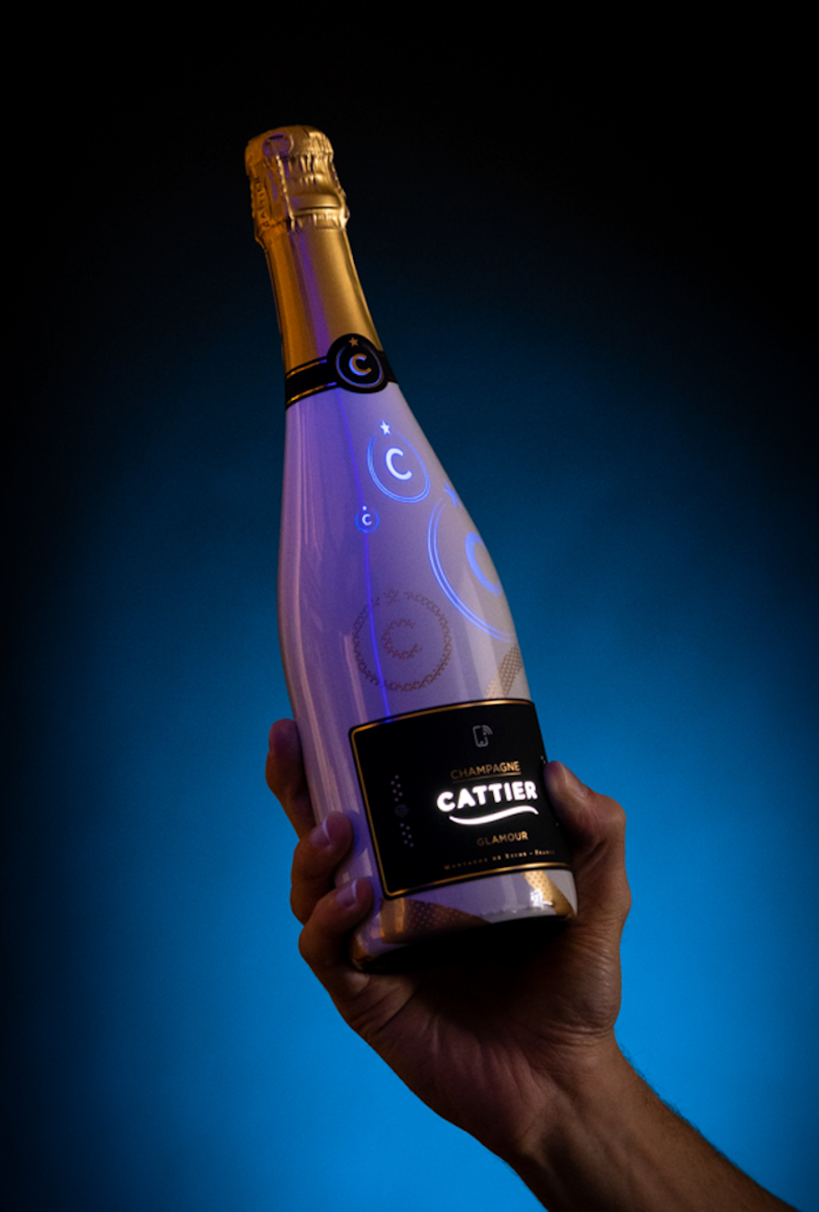
Light becomes premium when it supports the design rather than interrupts it. It should feel like part of the packaging language, not like a separate device attached to the pack.
This distinction is important. A flashing or overly bright effect can make packaging feel closer to a novelty item than a luxury product. But a soft illuminated logo, a glowing detail, a controlled reveal or a subtle halo can add focus and atmosphere without overwhelming the design.
In this sense, light can be understood as a sensory layer. It adds visibility, emotion and timing to the experience. While traditional finishes change how packaging reflects light, printed light allows packaging to emit light. That shift makes illumination an active premium finish rather than only a passive decorative cue.
Illumination is most convincing when it fits the context in which the product will be seen. For premium spirits, light can support bar visibility, nightlife activations and limited-edition launches. A bottle or label that glows subtly in a darker environment can create attention without relying on loud graphics.
In gifting, light can intensify the reveal moment. It can make the opening experience feel more memorable and ceremonial, especially when the product is connected to celebration, rarity or collectability.
In beauty and fragrance, light can support atmosphere and emotional storytelling. A glow, halo or illuminated signature detail can reinforce ideas of radiance, ritual, transformation or desire without changing the core structure of the pack.
For premium shelf displays, illumination can create controlled distinction. It can help the eye find one important element, such as a logo, symbol, product name or limited-edition detail. The goal is not to make the entire pack bright. The goal is to guide attention toward what matters.
Printed OLED can extend the traditional language of premium packaging finishes because it works through the same strategic logic: it makes quality more visible, more sensory and more memorable. But instead of only adding reflection, texture or contrast, it adds controlled illumination.
This is where printed light becomes especially relevant for luxury packaging. A premium finish should feel native to the pack. It should respect the surface, silhouette, material and brand world. Printed OLED is thin, flexible and designed for integration, which makes it more suitable for packaging than bulky electronic effects that feel attached rather than designed in.
When used well, printed light does not replace foil, embossing, soft-touch coatings or textured materials. It extends them. A brand can still use traditional finishes for tactility, structure and visual refinement, while light adds atmosphere, timing and interaction.
The strongest role for printed light is not to make packaging look futuristic for the sake of it. Its role is to create a more memorable premium experience. It can make a label more visible in a bar, make a limited edition feel more ceremonial, make a gifting moment more emotional or turn a signature brand detail into something the customer notices and remembers.
In luxury packaging, that is the real opportunity: light can become the next premium finish when it is subtle, purposeful and integrated into the design system.
Luxury packaging is strongest when every detail supports the same perception of value. Visual, tactile, structural and emotional cues should work together so the pack feels considered, intentional and connected to the product’s identity.
This is why the strongest luxury packaging is built on coherence. Material quality, weight, structure, typography, colour, texture, finish and reveal should all support the same impression. When these elements work together, the customer does not experience them as separate design choices. They experience one clear message: this product is valuable, carefully made and worth remembering.
The difference between luxury and tacky execution is often subtle. Gold, black, embossing, gloss, minimalism, texture or light can all support premium perception, but only when they are used with restraint and precision. When they are overused, poorly executed or disconnected from the brand, the same cues can make packaging feel artificial rather than refined.
Modern luxury packaging also has to balance beauty with responsibility. Premium no longer needs to mean more material, more weight or more decoration at any cost. In many categories, the new standard is fewer but better decisions: materials that feel refined, finishes that serve a clear purpose, structures that feel stable, and experiences that create emotional value without unnecessary excess.
As expectations around luxury packaging evolve, brands have more ways to create distinction. Traditional finishes such as foil stamping, embossing, debossing, spot UV and soft-touch coatings still play an important role because they add depth, tactility and focus. But new sensory layers can extend what premium packaging is able to do.
Printed light is one of those emerging layers. When used subtly and intentionally, it can add atmosphere, focus, timing and memorability without turning the pack into a gimmick. In that sense, light can become part of the premium packaging language: not a replacement for traditional finishes, but a new way to make packaging feel more emotional, visible and memorable.
The future of luxury packaging will not be defined by adding more effects. It will be defined by how well brands control the details that matter. The most premium packaging will be the packaging that feels coherent, sensory, meaningful and unmistakably intentional.
Looking to create a more memorable premium packaging experience? Contact Inuru.
What is luxury packaging?
Luxury packaging is packaging designed to increase a product’s perceived value through refined materials, precise structure, elegant finishes, craftsmanship, sensory details and controlled presentation. It does more than protect the product. It shapes how the product is perceived before, during and after opening.
What makes luxury packaging feel premium?
Luxury packaging feels premium when material quality, structure, texture, typography, finishes and presentation work together with restraint and precision. Consumers often read cues such as weight, rigidity, white space, tactile surfaces and selective embellishment as signs of higher quality.
What are the key elements of luxury packaging?
The key elements of luxury packaging include premium materials, strong structure, refined colour palettes, precise typography, tactile surfaces, foil stamping, embossing, debossing, spot UV, soft-touch coatings, controlled reveal, storytelling and sensory details such as light.
What colours make packaging look luxurious?
Black, white, gold, navy, burgundy, deep green, metallic accents and muted jewel tones are often used in luxury packaging. However, colour alone does not create luxury. The premium effect depends on material quality, contrast, proportion, print execution and how well the colour fits the brand.
Why does gold packaging sometimes look cheap?
Gold packaging can look cheap when it is overused, too yellow, poorly printed or applied without hierarchy. It feels more premium when used selectively, for example as a foil accent, logo detail or controlled contrast on a high-quality material.
What materials are used in luxury packaging?
Luxury packaging often uses glass, rigid board, thick paper stocks, textured papers, high-quality labels, metal details and precise closures. These materials can make the product feel more substantial, stable and carefully considered.
Which finishes make packaging look expensive?
Foil stamping, embossing, debossing, spot UV, soft-touch coatings, metallic inks, textured varnishes and matte-gloss contrast can make packaging look expensive when used with restraint. Their role is to create focus, tactility, depth and perceived value, not visual overload.
What makes luxury packaging look cheap?
Luxury packaging can look cheap when premium cues are overused or poorly executed. Too much gold, weak material, cluttered typography, excessive gloss, poor alignment or gimmicky effects can make packaging feel artificial rather than refined.
What is the difference between premium packaging and luxury packaging?
Premium packaging usually focuses on better materials, improved finishes and a higher-quality product experience. Luxury packaging goes further by adding symbolic value, craftsmanship, exclusivity, emotional storytelling and a stronger sense of ritual or desirability.
How does packaging influence consumer perception?
Packaging influences consumer perception by shaping expectations at first contact. Design, structure, material quality and sensory details can make a product feel more valuable, trustworthy, desirable or memorable.
Can light make packaging feel luxurious?
Yes, light can make packaging feel luxurious when it is subtle, purposeful and integrated into the design. Used as an accent, reveal or atmospheric detail, light can add focus, emotion and memorability. It feels premium when it works like a refined packaging finish, not like a flashing promotional effect.
Is luxury packaging always expensive to produce?
Luxury packaging is not only about production cost. Expensive materials can help, but the premium effect depends on proportion, execution, structure, typography, finish and brand fit. A simple package can feel luxurious when it is carefully designed and precisely executed.
Last updated: June 2026
SOURCES:
(2)https://www.mckinsey.com/industries/retail/our-insights/state-of-luxury
(3)https://journals.plos.org/plosone/article?id=10.1371%2Fjournal.pone.0186121
(4)https://www.sciencedirect.com/science/article/pii/S1878450X22001913
(5https://www.nature.com/articles/s41598-025-24077-6
(6)https://www.sciencedirect.com/science/article/pii/S2405844019312927
(7)https://www.sciencedirect.com/science/article/pii/S0148296322003630
(8)https://tesi.luiss.it/42276/1/766941_MANOLINO_EMMA.pdf
(9)https://www.diamondpackaging.com/media/uploads/fsea-foil-study-2014.pdf
.svg)


