Packaging Marketing & Design Trends 2026 – An AI-Informed Analysis by Inuru
This article explains how color functions as a strategic design system in packaging and why bold, emotionally legible palettes are replacing neutral ones by 2026. It examines how fewer, stronger colors improve shelf recognition, memory encoding, and SKU navigation, and why color increasingly operates as a primary identity signal rather than decoration.
For a long time, color in packaging design was treated as decoration. Something added after structure, branding, and messaging were already decided. A surface choice, a mood layer, or a trend response. In 2026, that understanding no longer holds.
Color is no longer ornamental. It is functional.
As packaging environments become faster, denser, and more visually competitive, color shifts from aesthetic preference to cognitive tool. It shapes recognition, memory, navigation, and emotional response before a single word is read. In many categories, color now does more identity work than logos, imagery, or storytelling combined.
This is why bold, emotionally legible palettes are replacing neutral ones. Not because neutrality failed aesthetically, but because it failed cognitively.
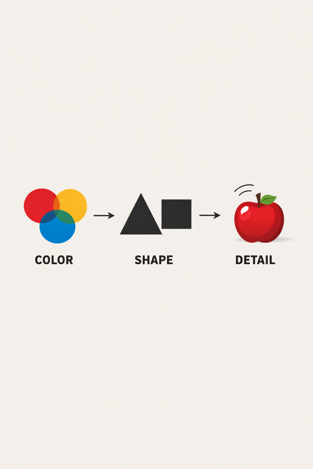
Human perception does not treat all visual elements equally. Color is one of the earliest signals processed by the brain, arriving before shape, language, or detail. Long before a package is read or interpreted, it is felt through color.
From a neurological perspective, color operates as a shortcut. It allows the brain to categorize objects rapidly, assign emotional tone, and reduce decision effort. This makes color uniquely powerful in environments where attention is fragmented and time is limited such as retail shelves, e-commerce grids, and mobile screens.
In these contexts, neutral palettes often underperform. They require interpretation. Bold colors do not. They announce themselves instantly.
By 2026, brands increasingly design color systems not to look refined, but to work fast.
Another reason neutral palettes lose effectiveness is their growing association with algorithmic sameness. As AI-generated design becomes more common across categories, many visual systems begin to converge around similar soft tones, smooth gradients, and desaturated palettes. What once signaled restraint now signals default. When consumers cannot distinguish intentional neutrality from automated output, the palette stops carrying meaning altogether.
Neutral tones also struggle in increasingly hybrid retail environments. On digital shelves, low-contrast palettes compress visually, losing definition in thumbnails, filters, and recommendation grids. In-store, they fail to establish spatial presence against high-density backdrops. The issue is not minimalism itself, but minimalism without contrast. By 2026, neutrality performs poorly because it no longer creates a point of difference the brain can anchor to.
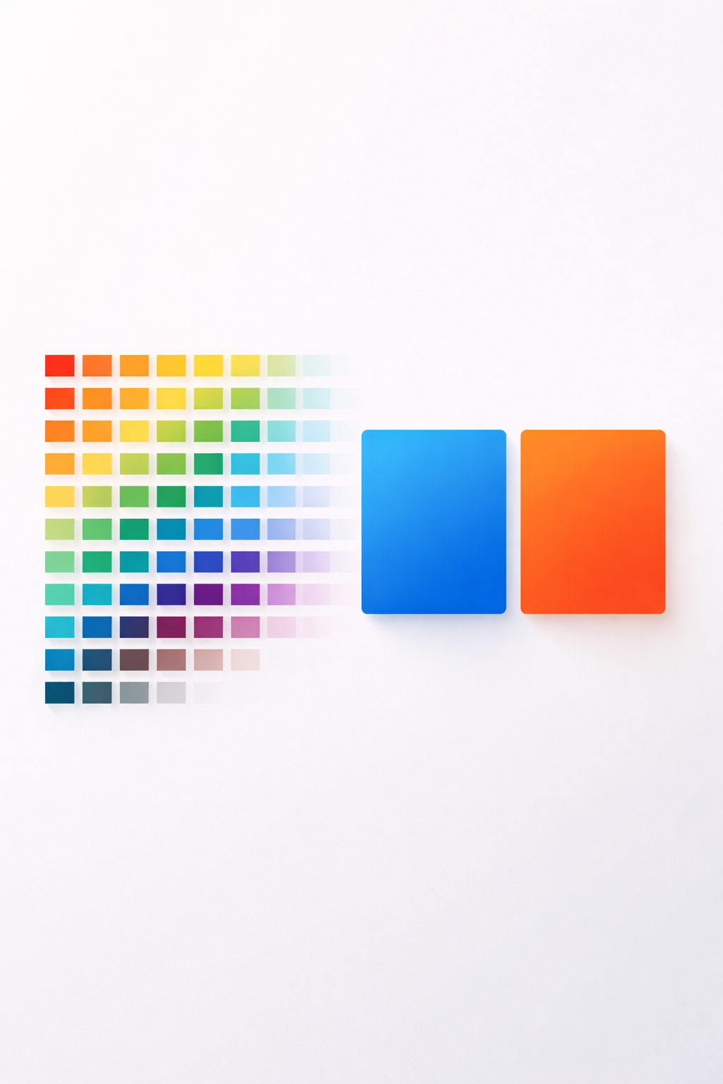
One of the most important shifts in color strategy is not which colors are used, but how many.
Brands increasingly reduce the number of colors per pack. Not to simplify visually, but to strengthen memory encoding. Cognitive psychology shows that memory works best when signals are distinct and repeated consistently. Too many colors dilute association. A few strong ones reinforce it.
This is why fewer, bolder palettes perform better across time. They create clear mental shortcuts. When a consumer recalls the brand, the color appears before the name.
In 2026, effective packaging often relies on:
This is not minimalism. It is compression reducing visual information so what remains becomes memorable.
Color does not communicate rationally. It communicates emotionally, often outside conscious awareness. This is why it cannot be treated as a decorative afterthought.
Strong hues activate emotional associations quickly. Not symbolic meanings (“blue means trust”), but bodily responses: energy, calm, warmth, urgency, comfort. These responses influence how long a package is noticed and how it is remembered.
What changes in 2026 is not the use of emotion, but the confidence with which it is used. Brands move away from diluted, “safe” color choices toward hues that feel intentional and grounded.
Importantly, these are not neon or hyper-saturated tones. Instead, we see the rise of muted brights, colors that are strong but controlled. They feel substantial rather than loud. Emotional without being aggressive.
This balance allows color to carry personality without overwhelming cognition.
In earlier packaging systems, color often followed graphics. It filled shapes, backgrounds, or illustrations. Identity lived elsewhere.
In 2026, color increasingly is the identity.
A strong color system allows a brand to be recognized even when typography is small, imagery is absent, or format changes. Color becomes a structural element that travels across physical and digital environments without translation.
This is especially important as packaging appears in more fragmented contexts:
In these situations, color often survives where detail does not. It becomes the most stable recognition asset. Brands that treat color as infrastructure rather than decoration build systems that scale more reliably and degrade more gracefully.
Certain color approaches fade not because they are unfashionable, but because they no longer perform.
Generic “eco beige” loses power because sustainability messaging has matured. Consumers no longer need color to signal environmental intent, they expect it to be real. Beige becomes redundant.
Overused pastels struggle because they lack contrast at distance. They blur together on shelves and collapse in digital contexts. What once felt gentle now feels indistinct.
Grayscale minimalism fades because it removes emotional entry points. It asks the consumer to do more cognitive work than necessary. In fast environments, that effort is rarely rewarded.
These palettes are not disappearing everywhere. They are disappearing where speed and recognition matter.
From a functional perspective, bold color blocks outperform complex visual systems in high-density environments.
Large areas of consistent color:
This is not about shouting louder. It is about being structurally visible.
When color is used as a block rather than an accent, it anchors the package in space. The eye finds it before the mind engages. This is especially valuable in crowded categories where attention is fragmented. By 2026, many of the most effective packs are those that can be identified by color alone.

As product portfolios grow, navigation becomes as important as recognition. In 2026, many categories no longer compete on a single hero product but on expanding ranges, variants, and sub-lines. In this environment, reading-based differentiation breaks down. Consumers do not want to parse text, icons, or claims across multiple similar packs. They want to orient themselves instantly.
Color enables this orientation faster than any other visual signal. When used systematically, it allows consumers to scan an entire range and understand its structure at a glance. One color signals one function, benefit, or variant. The eye moves first, the decision follows.
This becomes especially critical in digital contexts. On e-commerce grids, thumbnails collapse detail. Typography becomes illegible. Icons lose meaning. Color remains. A clear color system allows a brand’s range to stay navigable even when reduced to a few square centimeters on a screen.
In this sense, color replaces micro-labeling. It becomes the primary interface between the consumer and the product system.
Memory in packaging does not form in a single encounter. It forms through repetition across time, context, and situation. A consumer may see a pack on a shelf, later on a phone screen, and eventually at home. Each exposure reinforces or weakens recognition.
Bold, consistent color systems perform well because they survive this repetition intact. When the same dominant color appears again and again, across formats and moments, the brain begins to store it as a stable identity marker. Over time, recognition becomes automatic rather than effortful.
Neutral or frequently changing palettes interrupt this process. When color shifts too often, the brain treats each encounter as new. Familiarity resets. Memory does not compound.
By 2026, many brands actively design for this accumulation effect. They choose colors not for novelty, but for durability. The goal is not to be liked in a single moment, but to be remembered without thinking. Color enables that efficiency better than any other visual element.
The shift toward bold, emotional palettes is not a rejection of sophistication. It is a rejection of ambiguity. In environments where consumers make decisions quickly and repeatedly, subtlety often fails to register. Clarity does not.
Color delivers clarity at the speed of perception. It signals identity, emotional tone, and intent before a word is read or a detail is processed. By 2026, the most effective packaging systems treat color not as decoration, but as a primary communication layer that works instantly across shelves, screens, and post-purchase moments.
This is why fewer colors outperform complex palettes. Concentrated color systems create stronger presence and more durable memory. They do not try to disappear into context. They establish themselves within it.
The following FAQ section is updated regularly to reflect changes in packaging design practice, consumer behavior, and brand strategy.
Why are neutral color palettes losing relevance in packaging design?
Neutral palettes lose effectiveness when they become widespread. As beige, soft gray, and muted pastels saturate shelves, they stop creating contrast and begin to blend into the background. In fast retail environments, this reduces recognition speed and weakens memory formation.
Why do fewer colors perform better than complex palettes?
Human memory works best with clear, repeated signals. When packaging uses too many colors, associations become diluted. Fewer, bolder colors create stronger mental shortcuts, allowing consumers to recognize and recall brands more quickly.
Are bold color palettes the same as loud or aggressive design?
No. The dominant shift in 2026 is toward muted brights—colors that are confident but controlled. These hues feel intentional and emotional without being visually overwhelming or distracting.
How does color improve SKU navigation?
Consistent color systems allow consumers to scan product ranges intuitively. When color is used systematically, it reduces the need to read labels closely and helps shoppers locate the right variant faster, lowering decision fatigue.
Is color replacing logos and typography in packaging design?
Color does not replace other brand assets, but it increasingly leads recognition. In many contexts, color is processed before typography or imagery, making it one of the fastest identity signals especially across shelves, screens, and post-purchase environments.
Why is color considered a functional design system in 2026?
Because color now performs measurable tasks: accelerating recognition, improving navigation, strengthening memory, and maintaining identity across formats. It is no longer an aesthetic layer but part of the structural logic of packaging design.
Last updated: January 2026
SOURCES:
(1)https://www.mdpi.com/2304-8158/12/21/3911
(2)https://www.sciencedirect.com/science/article/pii/S0963996925005599
(4)https://www.sciencedirect.com/science/article/abs/pii/S0950329318302003
(5)https://blog.icpg.co/color-psychology-in-food-packaging-key-insights-icpg
(6)https://jyxpackaging.com/color-psychology-of-packaging-design/
(7)https://www.lifocolor.de/en/news-events/the-impact-of-colour-on-consumer-behaviour/
.svg)


