Packaging design must work without images in 2026 because most brand discovery now happens in small digital formats where photography becomes unreadable. As thumbnails and feed previews compress detail, type-first, abstract and high-contrast layouts deliver clearer recognition, faster processing and stronger recall than photo-dependent packaging.
Between 2021 and 2026, consumer attention shifted decisively toward digital-first environments. Most product encounters no longer happen through life-sized packaging placed on a physical shelf but through accelerated, high-density digital feeds. A product enters awareness as a compressed, near-symbolic fragment: a thumbnail on social commerce, a small preview inside a marketplace grid, or an AI-generated card that reduces packaging to its bare minimum. These contexts do not preserve detail; they eliminate it.
Photography collapses especially quickly under this pressure. The realism, texture and persuasive cues that make photographs compelling at large sizes degrade when compressed. A pack that appears expressive when printed at scale becomes a muddy, indecipherable block at 40–80 pixels. The more a design relies on imagery to communicate flavour, mood or value, the more fragile it becomes in the digital environments that now define visibility.
This is the heart of the 2026 shift: packaging must function under extreme reduction. If removing the photography causes the design to lose meaning, the design is no longer suited to the world consumers actually shop in.
When images shrink, our visual system changes the way it interprets them. The brain processes photographs primarily through high spatial frequency information: fine textures, edges, gradients and tonal nuances. These are the first elements to disappear when an image is reduced. Once this detail collapses, the visual cues needed for category recognition collapse with it. The photograph does not simply become smaller; it becomes cognitively ambiguous.
At miniature sizes, the brain shifts into low spatial frequency processing, relying on broad shapes and coarse contrasts. Photographic realism becomes counterproductive in this mode because it introduces noise the mind cannot resolve. Instead of supporting recognition, it forces the viewer into slow, effortful interpretation, a process fundamentally incompatible with fast-scrolling environments where attention lasts only milliseconds.
Typography and abstract signals operate differently. Symbols, letterforms and simple geometric forms are processed through a preattentive pathway, meaning the brain recognises them almost instantly and without conscious effort. They do not depend on fine detail; their structure remains legible even when heavily compressed. Cognitive research consistently shows that preattentive cues survive in rapid information streams, while detail-dependent imagery degrades beyond usefulness.
Shrinking images also alter emotional interpretation. Photographs traditionally carry both information and emotion, communicating indulgence, naturalness, warmth or scientific precision through micro-cues such as texture, highlights, facial expression or ingredient sheen. When these micro-cues disappear, the emotional layer disappears with them. What was once expressive becomes neutral.
This creates a counterintuitive effect: emotionally rich photographic packaging often becomes emotionally flat in its miniature form. The viewer no longer feels what the brand intended, because the triggers that create those feelings are no longer visible. The pack becomes informationally vague and emotionally quiet at the same time.
Typography and abstraction avoid this collapse. Their emotional meaning is structural, encoded in weight, geometry, colour temperature, curvature, spacing and rhythm. These qualities remain intact even at extremely small scales. A bold, condensed typeface still feels strong. A soft serif still feels warm. A deep red field still signals indulgence, while a pale, airy palette conveys purity. Emotional tone survives because it is built into the form, not into photographic detail.
This is why 2026 marks a psychological tipping point. The loss of photographic detail is not just a technical limitation; it is a loss of emotional fidelity. Realism no longer survives the compression that shapes most digital encounters, while symbolic and typographic cues become the primary carriers of meaning.
Photography struggles in the digital retail ecosystem because it was never designed to function at the scale or speed of modern discovery. A photograph’s meaning comes from its detail - the shine of a surface, the grain of a texture, the subtle cues that reveal freshness, quality or flavour. But when compressed, these become indistinguishable. The image still exists but no longer communicates.
Typography and abstract elements behave differently because they maintain structural integrity under pressure. A wordmark retains its identity whether shown at full size or reduced to a few millimetres. A geometric element or colour field remains recognisable even when everything else around it blurs. These symbolic cues operate as stable anchors in environments where photography dissolves into uniformity.
The brain favours symbols in rapid decision-making because they require almost no cognitive load. Letters and shapes are patterns the mind has been trained to recognise quickly and effortlessly. The viewer identifies them before they even consciously realise they have done so. Photography asks the brain to decode a scene. Typography simply signals meaning.
As 2026 unfolds, brands that built their packaging identity around lush visuals find themselves at a disadvantage. The physical world still rewards detail, but the digital world, which now sets the first impression, rewards clarity, immediacy and symbolic strength.
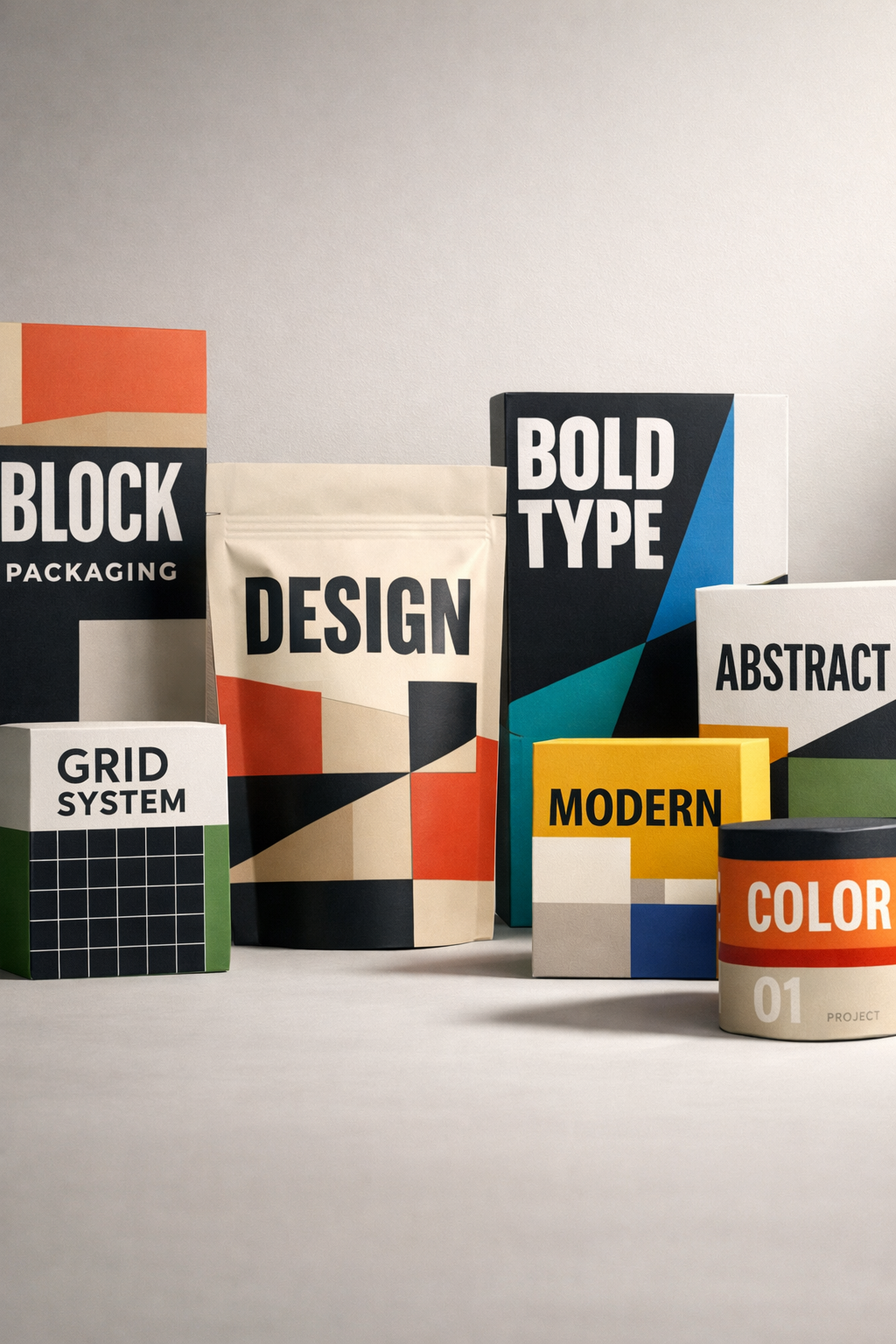
The rise of type-first and abstract packaging is not simply a design trend; it is the result of structural pressures created by digital commerce. Brands increasingly recognise that packaging must do more than look compelling at full size, it must remain communicative when reduced to a thumbnail, an icon or a single-colour silhouette. In environments where the first encounter is almost always miniature, clarity becomes the new form of impact.
Typography’s resurgence comes from its ability to compress meaning into a stable, resilient visual unit. A well-designed typographic hierarchy does more than present information: it expresses tonality, confidence, category and emotional position at a glance. Bold weights feel assertive, delicate serifs feel refined, tight spacing feels contemporary, while generous spacing feels calm and open. These qualities survive reduction because they are encoded in structure rather than photographic detail.
Abstract systems work in a similar way, functioning as a brand’s visual DNA. A single block of colour, a repeated curve or a distinctive negative-space shape becomes a recognisable signature even when everything else fades. Non-literal elements succeed because the brain treats them as symbols, not scenes and symbols endure compression far better than photographs. They create continuity across touchpoints: feed previews, marketplace tiles, dark-mode interfaces, retail shelves and physical packaging.
Type-first systems also respond to something more human: the consumer’s need for stability within visually chaotic environments. When every feed is saturated with colour, motion and competing stimuli, the brands that stand out are often the ones that create a sense of order. Clear typographic architecture works like a visual anchor. It slows the eye, reduces cognitive noise and offers a brief moment of perceptual clarity, a micro-pause within the overload. That clarity becomes a competitive advantage.
Abstraction leverages another powerful cognitive mechanism: shape priming. The brain remembers simple forms far more easily than complex imagery. A curved diagonal, a repeated circle, a divided field or a unique silhouette becomes a shorthand for the brand, especially when repeated across digital spaces. Over time, these abstract cues build the same associative strength once achieved through photography, but with far greater resilience across formats and resolutions.
In 2026, abstraction and typography operate as a dual system. Typography provides voice, hierarchy and tone; abstraction provides rhythm, recognition and memorability. Together they create a brand surface that remains legible in every context, from a two-millimetre icon to a full retail presence. This hybrid system is becoming the backbone of modern identity not because minimalism is fashionable, but because maximal environments now demand clarity rather than complexity.
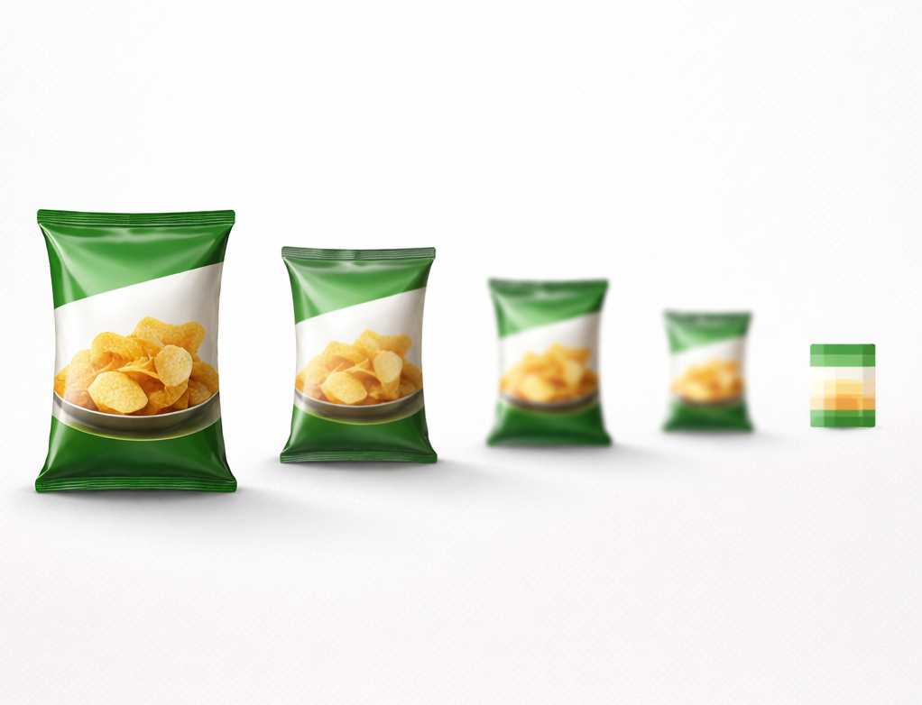
Designers increasingly use a simple but revealing test: shrink the pack to two millimetres. This reduction exposes whether the packaging is built on symbols or on images, and whether its identity can survive beyond ideal viewing conditions.
If, at two millimetres, the pack retains a traceable structure, a recognisable colour field or a typographic signature, it is built for the realities of 2026. If the pack becomes a blur, indistinct from competitors and devoid of category cues, it is overly reliant on realism and therefore unfit for environments where it will most often be seen.
What makes the 2 mm rule powerful is that it reveals the true hierarchy of brand communication. It shows that representation is less important than recognisability, that storytelling is less important than signalling, and that packaging must operate at the intersection of physical presence and digital reduction. In essence, the rule poses a single critical question: does the pack communicate when almost nothing is left?
As packaging becomes more signal-based, new modalities begin to play a role and light is the most powerful of them. Printed OLED technology introduces a form of communication that does not rely on representation at all. Instead of showing an image, the packaging behaves: it glows, pulses or illuminates in patterns that function as brand signatures.
Light is uniquely resilient under miniaturisation. A luminous mark remains visible even when everything around it is compressed, because the brain processes light as a preattentive cue, something recognised instantly and often subconsciously. When a pack emits light, it cuts through visual noise in a way photography cannot match. It becomes a micro-signal, a sensory marker that works regardless of scale, context or surrounding complexity.
Light-based design extends the logic of image-independent packaging because it shifts communication from representation to interaction. The consumer does not interpret a picture of a product; they witness a behaviour, a subtle glow, a pulse, a moment of activation, that signals technology, freshness or premium positioning. These behaviours remain effective in contexts where photography fails entirely: dark-mode interfaces, low-light environments, nightlife, clubs or evening retail settings.
In this sense, light-enabled packaging is the natural progression of the digital-first design approach. It is abstraction made sensory. It is symbolism made kinetic. And crucially, it is recognition made future-proof.
Photography is static. Typography and abstraction are structural. Light is behavioural. The brain is exceptionally sensitive to change, so even the smallest shift in illumination captures attention more effectively than any static visual. This makes light one of the rare cues that maintain their power as packaging shrinks, moves and competes within visually overloaded environments.
Printed OLED technology enables brands to build these behaviours directly into the pack without screens, external power or bulky components. Light becomes more than decoration; it becomes a semiotic tool, confirming an interaction, highlighting a functional zone, or creating a moment of surprise. In digital-first scenarios, where a consumer may only glance at a product for a fraction of a second, light acts as an immediate anchor of identity, something no photograph, however detailed, can replicate at miniature scale.
Light-based cues are also inherently abstraction-friendly. They don’t need to depict anything literal. A glowing line or symbolic illumination carries meaning through behaviour rather than representation. This aligns perfectly with the 2026 shift toward non-representational design systems. The pack becomes identifiable not because of what it shows, but because of what it does, an evolutionary step in how packaging communicates when visual space continues to shrink.

Packaging design must work without images in 2026 because the conditions under which consumers encounter products have changed. Discovery is compressed, attention is fragmented, and photography no longer survives the speeds and scales of digital environments. The brands that succeed will be those that build identity through typography, abstraction and symbolic clarity and increasingly, through emerging sensory cues such as light. As the space for storytelling shrinks, the power of well-engineered signals only grows. Packaging must now speak clearly even when it has almost no room to speak at all.
If you’d like to explore how your packaging can perform in digital-first environments, contact us.
1. Why are images becoming less effective in packaging design?
Images rely on high-detail information, which disappears when packaging is viewed in tiny digital formats. Once photographs collapse into low-resolution shapes, they stop communicating flavour, mood or value. Typography and abstract signals survive because the brain processes them as stable symbols rather than scenes.
2. Do consumers still notice images on packaging in online shopping environments?
Only partially. Most shoppers view products as thumbnails for a fraction of a second, which means they never see enough detail for imagery to work as intended. Recognition happens through colour, type and shape long before the viewer can interpret a photograph.
3. What makes typography more resilient than photography in 2026?
Typography communicates structurally: through weight, rhythm, spacing and proportion. These qualities remain legible even when compressed. A type-first design gives the brain a clear, fast, preattentive signal, while photos require slow, detail-dependent decoding.
4. How does abstraction improve packaging performance?
Abstract cues, curves, blocks, silhouettes, act as visual memory anchors. The brain recognises simple shapes far more easily than detailed imagery, especially when scrolling quickly. Abstraction also scales across every environment, from icons to physical shelves, without losing impact.
5. What is the 2 mm rule in packaging design?
It’s a simple test: shrink the pack to two millimetres and check if it still communicates brand, category and tone. If the design collapses into a blur, it depends too heavily on images. If recognisability remains, the packaging is built for real-world digital conditions.
6. Why is light-based design relevant to the shift away from images?
Light functions as a behavioural signal, not a representation, so it remains visible even when the pack is heavily reduced. Technologies like printed OLED allow a brand to express identity through glow, pulse or illumination patterns that the brain notices instantly, regardless of scale. This makes light one of the few sensory cues that survive digital compression.
7. Does image-independent packaging mean removing photography entirely?
Not necessarily. Photography can still play a supporting role on high-resolution surfaces or secondary panels. But the primary face of the pack must rely on symbols, type and abstraction, elements that deliver immediate clarity even when viewed at miniature size.
Why can’t packaging rely on images anymore?
Because images lose detail when reduced to thumbnail size, making them unreadable and unreliable for first-moment recognition.
What replaces photography in 2026 packaging?
Typography, abstraction and light-based cues replace photography because they remain legible under extreme compression.
Do photos still help on packaging?
Yes, but only as secondary elements. Primary recognition must come from signals the brain can process instantly.
How do light-enabled packs help visibility?
Light behaves as a preattentive cue, making the pack recognisable even when surrounding visuals shrink or blur.
Last updated: February: 2026
SOURCES:
(1)https://www.sciencedirect.com/topics/agricultural-and-biological-sciences/visual-perception
(2)https://uxplanet.org/preattentive-processing-and-design-e59eba74373e
(3)https://www.nngroup.com/articles/mobile-list-thumbnail/
(6)https://www.interaction-design.org/literature/topics/visual-hierarchy
(7)https://thedecisionlab.com/reference-guide/philosophy/system-1-and-system-2-thinking
(8)https://www.scientificamerican.com/blog/guest-blog/lost-in-the-details-or-just-paying-attention/
(9)https://cloudinary.com/blog/visual-media-reduces-returns-global-e-commerce-survey
.svg)


