Flat packaging design works better in digital environments because its simplified shapes and high contrast remain clear at small sizes. Dimensional packaging design performs better on physical shelves, where depth cues like shadows and highlights guide attention. In 2026, the most effective packaging combines both: flat clarity for screens and intentional optical depth for shelf impact.
Packaging design in 2026 operates in a dual reality. Every piece of packaging must perform in two environments at once: the physical shelf, where attention is fragmented and competition is immediate, and the digital screen, where recognition must happen in under a second. This shift has made the visual language of packaging more critical than ever, especially as e-commerce, quick-commerce and visual search continue to reshape how consumers encounter brands.
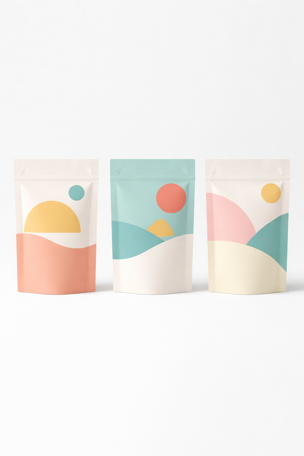
Within this context, two design approaches dominate the conversation: flat and dimensional packaging design. Flat design expresses the brand through simplified forms, solid colours, high-contrast shapes and typography that reads clearly at any size. It is direct, modern and instantly recognisable, especially when compressed into thumbnails, product tiles, social content or AI-driven search formats.
Dimensional design takes a different route. Instead of relying on minimal forms, it builds visual hierarchy through depth cues such as shadows, highlights, gradients, layering, and subtle optical perspective. These techniques simulate physicality and guide the viewer’s gaze across a composition, creating a sense of richness, tactility and value that often performs strongly in real-world, three-dimensional retail settings.
What makes 2026 different is that depth itself is undergoing a redefinition. For decades, depth on packaging was created through materials: embossing, debossing, foil, speciality varnish, multi-layer structures or photographic realism. Today, depth is increasingly designed rather than manufactured. Brands are creating the illusion of dimensionality using purely visual tools: contrast, micro-shadows, controlled gradients, optical layers and, in emerging cases, light as a form of emphasis. This enables stronger impact while supporting recyclable-by-design structures and simplifying material complexity.
At the same time, AI-driven commerce, algorithmic product listings and visual search introduce new constraints. Machine vision models read flat shapes faster and more consistently, yet humans still respond strongly to the sense of depth and directionality found in dimensional layouts. As a result, the question is no longer which style is “better,” but which style performs more effectively in each environment and how these approaches can be combined into a single cross-channel design system.
This article examines how flat and dimensional packaging design function on shelf and on screen, what visual depth means in 2026, why consumer perception is evolving, and how the most successful brands align both approaches into one coherent identity. It also explores how emerging sensory cues, especially OLED illumination, fit naturally into this evolution by adding real, non-material depth that works across both retail and digital contexts.
Physical shelves are high-pressure environments for attention. Shoppers make most packaging-driven decisions in 0.3 to 1.5 seconds, according to eye-tracking studies. In that micro-window, the brain prioritises contrast, directionality, depth cues and perceptual hierarchy. Elements that dimensional design naturally amplifies.
Dimensional packaging performs better on shelves because it mirrors how humans are wired to navigate visual scenes. The visual system uses shadows, highlights and depth gradients as powerful signals of importance and proximity. According to research in visual cognition, depth cues act as “attentional magnets,” pulling the gaze toward the element that appears spatially closer or more illuminated.
On a crowded shelf, where dozens of products compete simultaneously, this creates a decisive advantage. A subtle drop shadow behind typography, a directional highlight on a product name, or a layered composition that creates near-far depth helps the eye locate the brand faster than a flat layout of equal visual weight.
Psychology also plays a role. Studies on consumer neuromarketing show that dimensional cues increase perceived value and craftsmanship, even when the depth is purely optical. The brain interprets depth as effort and richness, associating it with premium quality. This is why categories like cosmetics, spirits and confectionery often rely on dimensional layouts to signal desirability and prestige.
However, dimensional design only works when used with restraint. Excessive gradients, decorative shadows or complex photographic layers can slow recognition and create visual noise, particularly dangerous in fast-moving FMCG settings. The designs that perform best in 2026 use “functional depth”: a single focal element that guides the gaze without overwhelming the overall clarity of the pack.
This marks an important shift. Depth no longer needs to rely on embossing, foil or physical material layers. Modern packaging increasingly uses designed depth - optical illusions created through contrast and controlled lighting effects. These techniques support recyclability and avoid adding material weight, making them compatible with monomaterial structures and sustainable packaging requirements.
In short, on physical shelves, dimensional design wins because the human eye follows depth cues instinctively. But the brands that stand out the most in 2026 are not those that use the most depth, only those that use it most intentionally.

Digital platforms reward clarity, speed and recognisability. Most interactions with packaging happen in fractions of a second while users scroll through product tiles, social posts, video feeds or marketplace grids. In this environment, flat packaging design has a natural advantage because it maintains its structure and meaning even when heavily compressed or reduced to a very small size.
Flat layouts use bold shapes, simplified silhouettes and clear typography; elements that remain legible when transformed into thumbnails, story frames or algorithm-selected preview images. Research on digital attention patterns consistently shows that the eye identifies flat, high-contrast designs faster than visuals built on gradients or subtle depth transitions. Dimensional details such as soft shadows or layered compositions often collapse into noise when resized or rendered on mid-quality screens, making the pack less identifiable at a glance.
Digital environments introduce another factor: machine perception.AI-driven discovery systems, visual search tools and recommendation models rely on shape, colour blocks and contrast to classify packaging quickly. Flat designs align naturally with how these systems recognise and cluster products. They provide unambiguous contours and stable forms, features that improve both visibility and ranking in environments increasingly governed by automated selection.
This does not mean dimensional design has no place online. In motion-first contexts such as short-form video, live shopping or animated placements, dimensional cues can perform extremely well. Controlled highlights, emphasised edges or micro-shadows can create a sense of movement and depth that stands out in a dynamic feed. The key is that the depth must be intentional and visible even when the image is moving fast.
The strongest-performing digital designs in 2026 combine the stability of flat systems with a single dimensional accent that survives compression: an outlined highlight, a crisp shadow or a defined edge. This blend ensures recognisability in static thumbnails and differentiation in dynamic content, while remaining aligned with how both humans and AI perceive visual information.
In 2026, brands are redefining depth in packaging. Instead of relying on embossing, foils or textured varnishes, depth is increasingly created through visual illusion rather than physical construction. Designers use micro-shadows, edge lighting, layered typography and controlled gradients to build hierarchy inside a flat material system. This makes depth more flexible, more sustainable and far better suited to cross-channel performance.
The important shift is that depth is no longer treated as a structural feature, it becomes a visual signal. Once it moves into the realm of signal rather than substrate, depth becomes easier to manipulate, easier to scale across formats and more consistent between shelf and screen. It also opens space for new forms of emphasis that do not rely on added material layers.
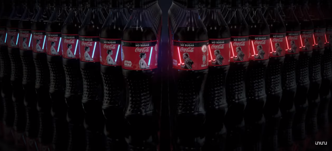
One of the emerging tools in this space is light-based emphasis. When depth is understood as an optical cue, light naturally becomes part of the toolkit. Subtle illumination, such as a micro-highlight on a symbol or a controlled glow around a brand asset, creates real depth without adding weight or complexity. This turns light into a new dimensional language: one that is immediate, unmistakable and visible in both physical and digital environments.
The broader implication for brands is clear: depth is becoming lighter, smarter and more intentional. It moves away from decoration and toward precision, designers use only as much depth as needed to direct attention and shape perception. As materials simplify and digital visibility becomes equally important as shelf visibility, illusion-based depth and light-based cues form the new foundation of premium packaging aesthetics.
Consumers respond differently to flat and dimensional packaging because each approach activates distinct perceptual and emotional pathways. Flat design is processed extremely quickly. The brain prioritises clear contours, solid blocks of colour and simplified geometry, which reduces the effort needed to understand what the product is and where the key information is. This “instant legibility” is why flat designs consistently perform well in environments where attention is short and decisions are rapid, such as digital feeds or dense category shelves.
Flat design also aligns with a growing desire for transparency and straightforwardness. Its minimal, stripped-back structure communicates confidence: nothing is hidden behind effects or heavy decoration. This can create an impression of modernity, efficiency and trustworthiness. Many consumers associate flat packaging with brands that are direct, contemporary and product-first.
Dimensional design activates a different psychological mechanism. Humans intuitively rely on depth cues, shadows, highlights, perspective, to interpret the physical world. When these cues appear on packaging, they signal importance and guide the viewer’s eye toward specific elements. The brain treats a lifted logotype, a highlighted edge or a layered composition as cues of proximity and value. This makes dimensional designs feel richer and more crafted, even when the depth is not physically present.
Emotionally, dimensional design carries more sensory weight. Soft gradients, optical layering and subtle lighting transitions create an impression of tactility and materiality. This triggers associations with craftsmanship, care and premium quality. It also produces a sense of “visual touch,” an effect that makes the product feel more real and physically present,a benefit flat design intentionally avoids.
Context shapes these reactions further. In categories where emotional resonance matters: cosmetics, beverages, confectionery, dimensional cues often feel more aligned with the product story. In categories where clarity, performance or function dominate supplements, tech accessories, wellness, flat design communicates efficiency and precision more effectively.
Importantly, the most successful 2026 packaging does not force consumers to choose between clarity and richness. Instead, it blends both responses: the initial snap-recognition of flat systems with a focal point of dimensionality that adds meaning. This combination reduces cognitive load while still offering a moment of crafted emphasis, creating an experience that is both immediate and memorable.
As consumers move fluidly between shelf and screen, their expectations evolve in the same direction. They want packaging that reads instantly, behaves consistently across channels, and still delivers enough depth to create a sense of intention and emotional presence. In other words: clarity first, dimension second but both working together.
As product discovery shifts toward visual search, automated recommendations and AI-driven cataloguing, packaging design must perform not only for human perception but also for machine perception. AI image recognition systems evaluate packaging using different cues than shoppers do, and these cues increasingly influence which products appear, where they appear and how quickly they are recognised across digital platforms.
AI models prioritise clear contours, distinct colour blocks and stable geometric forms. These features reduce ambiguity when the system tries to identify, classify or group a product. Flat packaging design naturally aligns with this logic: its simplified shapes and high-contrast layouts create an unambiguous outline, even when the image is compressed, cropped or viewed at thumbnail scale. A flat pack often remains recognisable after multiple layers of resizing or recompression, typical of marketplace feeds, social commerce and automated product tiles.
Dimensional design interacts differently with AI vision. Depth cues that guide the human eye may be interpreted by algorithms as noise or background. When depth is subtle, the model may misread the hierarchy of the pack or fail to detect its primary figure–ground separation. This can lower ranking within visual discovery systems, especially in platforms that sort products using similarity clustering.
However, dimensional packaging can still perform strongly when used with clear, high-contrast anchors. AI models respond effectively to dimensionality that is defined rather than decorative: crisp shadows, clearly separated layers, sharp light accents, or well-outlined structural shapes. These elements create a strong enough edge profile to survive machine processing while still offering human-visible dimensional richness.
AI recognition also influences cross-channel visibility. Packs that are reliably detected by algorithms are more likely to appear in product recommendations, auto-generated category groupings, visual search results and AI Overviews summaries. Consistency becomes an advantage: designs that maintain recognisability across multiple lighting conditions, camera qualities and resizing scenarios gain algorithmic stability, which directly affects discoverability.
This creates a new design requirement for 2026: packaging must communicate on two levels simultaneously. It needs a machine-readable skeleton: the flat, high-contrast, contour-first foundation and a human-readable layer that provides emotional depth or crafted emphasis. Brands that optimise both layers create packaging that is instantly legible in any condition, whether scanned by an AI model or assessed by a shopper in a store.
Light-based cues are beginning to play a role here as well. When illumination is used as a clear, controlled outline or focal highlight, it enhances edge detection for AI and increases salience for humans. As packaging becomes more frequently photographed, scanned or auto-categorised, these hybrid cues, optical for machines, expressive for people, will increasingly shape how products are ranked and recognised.
The debate between flat and dimensional packaging design is no longer a choice between two opposing styles. In 2026, it becomes a question of performance: how packaging behaves on a crowded shelf, in an accelerated digital environment and within AI-driven discovery systems. Flat design offers unmatched clarity and instant recognition at small sizes, while dimensional design guides attention, builds hierarchy and elevates perceived value in physical retail.
What defines the new direction is not choosing one over the other, but combining them with intention. The strongest packaging of 2026 uses a flat structural foundation for legibility and consistency, then adds selective, designed depth: optical cues, micro-shadows, light-based highlights to create a focal point that feels crafted, premium and emotionally resonant.
This hybrid model aligns with how both humans and algorithms perceive the world. It delivers clarity for digital systems, dimension for human attention and coherence across every channel where packaging must compete. As materials simplify and visual search accelerates, the brands that balance these layers will define the next generation of packaging visibility.
To explore how light-based cues and printed OLEDs can enhance packaging visibility, contact us.
What is the difference between flat and dimensional packaging design?
Flat design uses simplified shapes and high contrast for instant clarity, while dimensional design uses shadows, highlights and optical layering to create a sense of depth and hierarchy.
Which performs better on store shelves?
Dimensional packaging usually performs better on shelves because depth cues guide attention and help shoppers locate key information faster.
Which design style works best in digital environments?
Flat design typically performs better online since it remains clear and recognisable when resized into thumbnails, product tiles or compressed images.
Why do consumers respond differently to flat and dimensional design?
Flat design feels modern, transparent and efficient, while dimensional design feels crafted, tactile and more emotionally expressive.
Does dimensional design hurt digital performance?
Not necessarily, dimensional elements work well online when they use clear, high-contrast accents that remain visible even when compressed.
How does AI image recognition affect packaging design choices?
AI models read bold contours, clear shapes and simple colour blocks more reliably, giving flat-heavy designs an advantage in automated classification and ranking.
Why is depth shifting from a material feature to a visual illusion?
Sustainability, monomaterial structures and cross-channel consistency push brands to create depth through optical design instead of physical finishes.
Can light-based elements improve packaging visibility?
Yes, controlled illumination, including ultra-thin OLED accents, can create clear focal points that stand out for both human perception and AI image detection.
What is the best packaging approach for 2026?
A hybrid system: flat foundations for clarity and machine readability, combined with intentional dimensional cues that provide emotional depth and shelf impact.
Is dimensional design still relevant if a brand prioritises minimalism?
Yes, minimalist brands often use micro-depth, such as a single shadow, highlight or optical lift, to create a focal point without increasing visual noise.
Last updated: February 2026
SOURCES:
(1)https://www.sciencedirect.com/science/article/pii/S0042698919301075
(2)https://www.nngroup.com/articles/powers-of-10-time-scales-in-ux/
(4)https://www.mdpi.com/2624-862X/6/1/4
(5)https://millionpack.com/packaging-psychology/
(6)https://www.eyesee-research.com/knowledge/kellanovas-case-study-ai
(7)https://arxiv.org/abs/2403.02336
(9)https://www.interaction-design.org/literature/topics/visual-hierarchy
(10)https://www.verywellmind.com/what-is-the-opponent-process-theory-of-color-vision-2795830
.svg)


