Designing packaging for speed refers to creating visual systems that communicate identity, purpose and value within the first second of being seen. As shoppers increasingly scan shelves and encounter products as small digital thumbnails, fast recognition becomes a core performance requirement, shaped by clear hierarchy, strong contrast and typography that remains legible under motion and compression.
Packaging once belonged to a world where people slowed down. A shopper would stand in front of a shelf, pick up a product, turn it in their hand, and notice colour, texture, illustration and detail. Those moments still happen, but they are no longer where most decisions are made. By 2026, packaging is judged inside a much smaller timescale. People move faster, scroll faster, compare faster, and filter faster. The moment in which design has to work has become extremely narrow, and it now sits inside the first second of seeing something.
This change is not a matter of taste or fashion. It comes from behaviour. Consumers walk through aisles without pausing. They scroll feeds with their attention divided across several tasks. They see dozens of products in miniature form long before they encounter them in a store. In these conditions the brain makes an initial judgment based on only a few visual cues. If those cues are slow, ambiguous or overly subtle, the pack disappears from consideration before the viewer even realises it was there.
The idea of speed in packaging design is not about rushing or reducing the experience. It is about recognising the environment in which design now has to function. A pack must communicate identity, intent and value in less time than it takes to shift focus from one object to another. That window is brief, but within it, the brain is remarkably decisive. Brands that understand this create designs that work instantly. Brands that ignore it risk becoming invisible.

Retail once depended on browsing. People allocated attention deliberately. The shelf was the place where discovery happened. Designers could assume that the viewer would lean in, read, compare and evaluate. Much of the aesthetics that dominated the last two decades grew from this assumption. Intricate illustration, fine-line typography, gentle pastel colour systems, small infographics and layered gradients all relied on a viewer who stayed still long enough to absorb detail.
That viewer exists less frequently now. Modern behaviour is shaped by movement and by distraction. A shopper walks while scanning. Their eyes sweep across several products at once. Their peripheral vision handles most of the work long before focused attention takes over. Online, the same behaviour repeats. Marketplace listings and social shopping feeds present packaging as tiny images that appear and disappear during scrolling. Very few people zoom in. Very few pause long enough to notice subtlety.
The design challenge therefore sits inside this new kind of attention. Packaging must survive the filter that happens before conscious evaluation. It must signal meaning while the viewer is in motion or while the image is extremely small. If it fails in this early layer, it never enters the decision process.
The first second of a visual encounter is not used for analysis. It is used for orientation. The brain looks for a few simple pieces of information: shape, contrast, direction, and a primary message. These elements are processed much faster than detail. The pack has to make its purpose legible inside that short window. If it does, the viewer grants it more time. If it does not, the viewer continues scanning.
On a shelf, this one second often happens while the viewer is still walking or while their head is turning. Online, it happens while scrolling, usually on images that measure around two hundred pixels. In both contexts the design is not seen in ideal conditions. It is seen in motion, reduced, compressed, or viewed indirectly. Effective packaging anticipates these conditions and performs well inside them.
The question the viewer resolves almost immediately is very simple. What category is this and what role does it play. Only after that first question is answered do secondary messages have any chance of landing. Claims, certifications, ingredient stories and technical detail all happen later. The first layer of communication is about clarity.
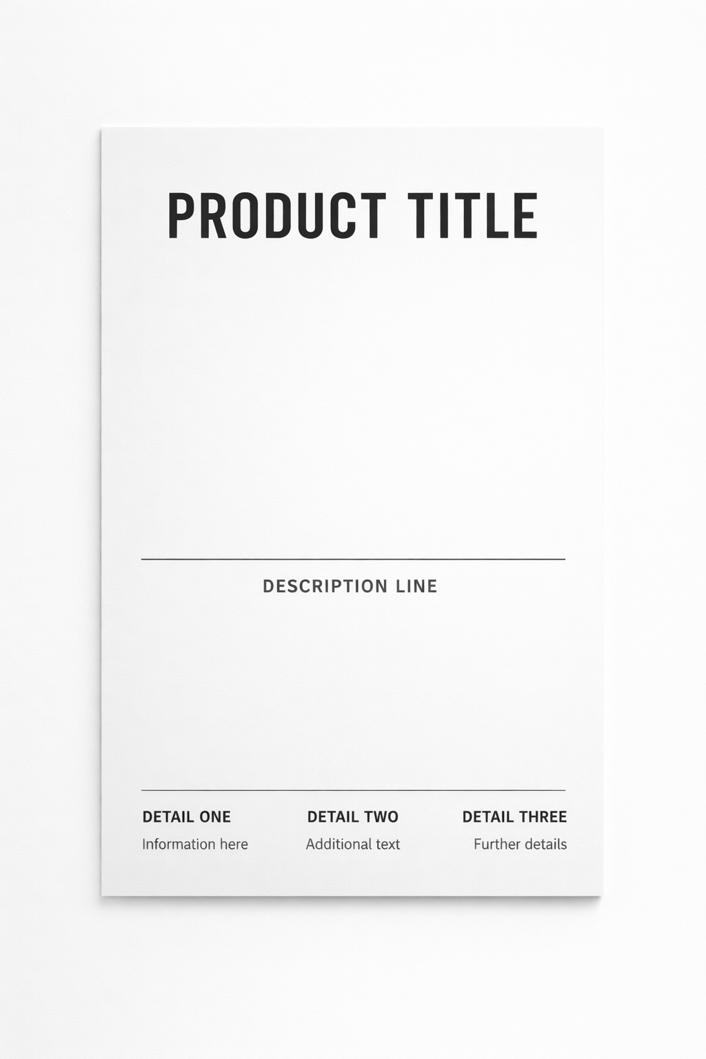
When time is compressed, structure drives understanding. The viewer follows visual cues that require minimal effort. This is where hierarchy becomes decisive. A clear vertical structure gives the eye a path, even when attention is fragmented. The viewer begins at the top, moves through the centre, and ends at the base. This instinctive order exists even in moments that feel chaotic or rushed.
A pack that respects this movement communicates far more quickly than one that distributes information evenly. The top must anchor identity or category. The centre must express the product’s purpose or most important benefit. The lower area carries the supporting details for those who continue reading. When hierarchy is strong, the viewer does not have to search for meaning. Meaning appears naturally.
This shift does not reduce creativity. It focuses it. Once roles on the pack are clear, designers can make stronger decisions about emphasis, contrast and typography. Clarity frees the design to be expressive without becoming confusing.
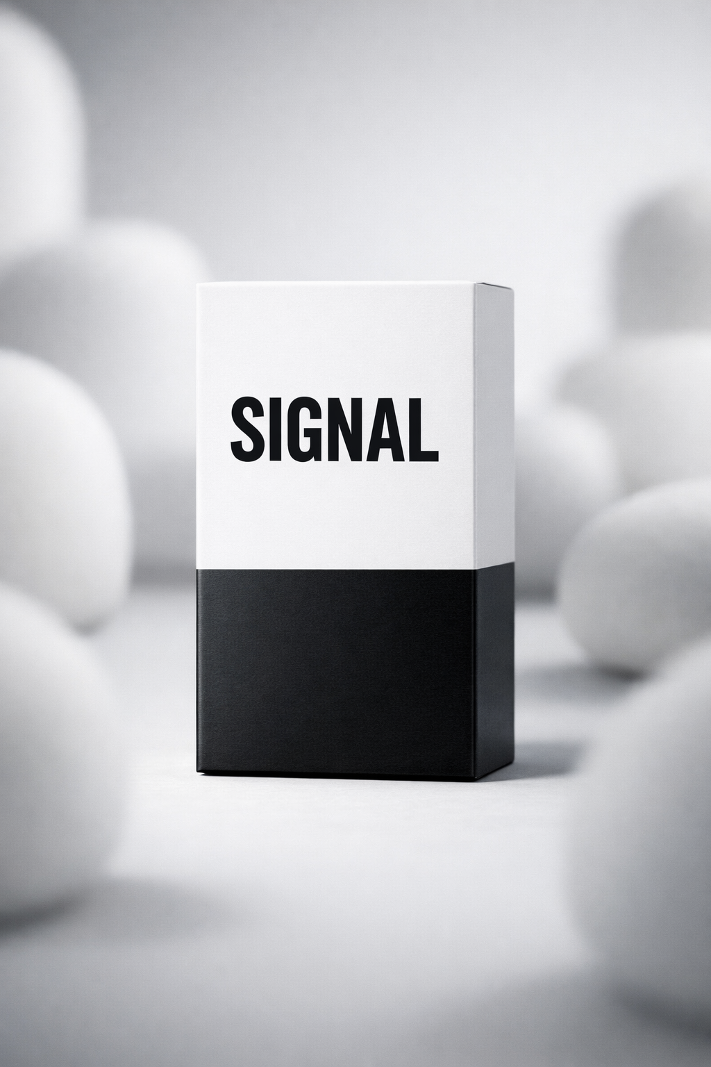
Contrast plays an essential role in fast comprehension. The visual system detects contrast long before it recognises finer elements like texture or soft tonal variation. When the viewer is moving or when the pack is small, contrast becomes the main tool that signals presence.
Many contemporary aesthetics collapse under these conditions. Gradients that look rich on a monitor blur on a shelf. Pastel hues merge into the background of a brightly lit retail environment. Thin lines dissolve at small scale. Even high quality illustration loses definition when seen in peripheral vision. What survives is separation between light and dark, between foreground and background, and between type and its surrounding field.
For this reason packaging in 2026 often relies on fewer colours used with more decisiveness. Blocks of colour give the design a stronger outline. Deep contrasts make the pack easier to recognise even when blurred. A single bright accent can guide the eye more effectively than a complex palette. These choices strengthen the design in the first second and allow a slower set of details to emerge later for those who take the pack in their hand.
Typography shifts from expressive nuance to functional clarity. The size, weight and placement of type become the main tools of communication. Large, confident type carries meaning faster than imagery because it resolves quickly under blur and compression. A viewer can recognise a word even when the pack is slightly out of focus. A small, delicate typographic system cannot achieve this.
This does not make typography generic. It makes it central. Distinctive type can become part of the brand’s identity when used with intention. Letterforms, spacing and proportions can form a visual signature that is visible long before the viewer reads the smaller details. When type is given the space to rise to this role, the pack gains a voice that is clear and memorable.
Typography also has to support benefit positioning. The main promise of the product is often best communicated through a strong typographic element in the centre of the pack. This is where the viewer looks first after registering the overall form. The benefit must be phrased simply enough to decode fast, and positioned clearly enough to stand out even at thumbnail scale.
Designing for speed requires focus. A pack cannot present five messages in the opening layer. The viewer will not resolve them before moving on. The design must decide which benefit shapes the purchase decision and lead with that. All other information supports this central idea, but does not compete with it.
When the central benefit is clear, the pack feels confident and straightforward. When the benefit is hidden inside decorative elements or placed among too many competing messages, the pack feels hesitant. The viewer does not know where to look, and the design slows down at exactly the moment it needs to be fast.
A strong benefit message does not simplify the product. It prioritises the first second. After that second, the viewer can discover more. In other words, clarity unlocks depth.
Detail has not disappeared. It has moved. Fine illustration, texture, micro-patterns, material finish, and precise typography all contribute to the emotional quality of a design, but they operate after the viewer has already decided that the pack is worth examining. These details now belong to the second layer of communication.
This shift helps brands think more clearly about the role of each element. The pack no longer tries to achieve everything at once. It performs in stages. The first stage is visual recognition. The second is comprehension. The third is persuasion. Detail plays a major role in the final two stages, but it should not be asked to carry the first.
Many legacy designs struggle here. They were built for close inspection, not for motion or reduction. Their visual identity depends on layers that disappear under real conditions. When translated into today’s environment, they feel slow even if they are beautifully crafted.
Design that performs quickly does not need to look minimal or restrained. It often looks bold. A clear structure allows colour and type to take on more expressive roles without confusing the viewer. A strong layout creates room for emotional storytelling because the core message has already been delivered.
This is why many 2026-ready packs appear direct and decisive. They favour colour blocks, confident type and firm visual separation. They create silhouettes that remain recognisable at any distance. They feel modern not because they follow a particular style but because they match the pace of real behaviour.
Premium design also evolves under this logic. In the past, premium meant complexity or craft that took time to appreciate. Today premium tends to mean clarity delivered with precision. A highly considered structure, metered spacing, and intentional colour can feel more elevated than intricate detail that disappears under everyday conditions.
The central principle of speed-driven packaging design is simple. A pack must work in the context in which it is actually seen. That context is often imperfect. Retail lighting varies. Shelves are crowded. Online images are small. Shoppers are moving. Many of the traditional markers of quality cannot be relied upon to capture attention under these conditions.
A modern design process tests the pack in these real contexts. It is viewed from a distance, in motion, at small sizes and among competitors. Designers watch where the eye naturally lands and how quickly the pack signals meaning. Adjustments are made to strengthen the first second before refining the details that follow.
This approach does not reduce design to functionality. It acknowledges that communication and emotion work together. A pack that cannot be noticed cannot be appreciated. A pack that is clear early opens the possibility of storytelling later.
A quiet rule now shapes high performing packaging. If a design only reveals its value when someone slows down and looks closely, it does not meet the needs of modern retail. Design must succeed in the immediate moment as well as the reflective one. This dual role creates a higher standard, not a lower one.
Brands that understand this create packaging with strong structure, concentrated meaning and expressive clarity. Their designs do not wait for perfect viewing conditions. They work in motion, in peripheral vision and on screens as easily as in the hand. They meet the shopper where attention actually lives and they communicate with precision inside that brief window.
Speed does not replace creativity. It focuses it. It gives design a clear purpose and asks brands to express their identity with confidence. In an environment where every product competes for a single second of recognition, clarity becomes one of the most powerful forms of differentiation.
For more updates from Inuru and the full Packaging Marketing and Design Trends 2026 series, visit our news hub.
This FAQ is part of our ongoing Packaging Marketing and Design Trends 2026 series and is updated regularly as market behaviour evolves.
Why does packaging need to work in the first second?
Because most shoppers filter products before they consciously look at them. If a pack does not communicate its category and purpose instantly, it never enters consideration.
Does designing for speed mean simplifying the design?
Speed requires clarity, not minimalism. A design can stay expressive as long as its main signals resolve quickly.
Will this make all packaging look the same?
No. Structure becomes consistent, but tone, typography, colour decisions and spatial rhythm remain brand-specific.
Where does storytelling fit when speed comes first?
Storytelling begins after recognition. Once the viewer understands the pack immediately, they are more willing to explore detail.
Does speed limit illustration or craft?
Not at all. These elements simply move to the second layer of engagement instead of carrying the first impression.
How can a team check if a design is fast enough?
By testing it in motion, at distance, among competitors and at small digital sizes. If clarity survives, speed is working.
Does this apply across all categories?
Yes. In fast-moving categories it drives choice, and in premium categories it creates confidence and reduces friction.
What happens when a design ignores speed?
It performs well only in ideal conditions and becomes invisible in real ones.
Last updated: January 2026
SOURCES:
(1)https://www.sciencedirect.com/science/article/pii/S0042698911003415
(2)https://www.nature.com/articles/nn.3716
(3)https://pmc.ncbi.nlm.nih.gov/articles/PMC4016153/
(4)https://www.jstor.org/stable/10.1086/677315
(5)https://www.sciencedirect.com/journal/journal-of-retailing
(6)https://www.sciencedirect.com/journal/journal-of-business-research
(7)https://jov.arvojournals.org/article.aspx?articleid=2132002
.svg)


