Packaging Marketing & Design Trends 2026 - An AI-Informed Analysis by Inuru
Typography-led packaging is a design approach where letterforms replace logos and graphics as the primary brand signal. This article explains why typography becomes a dominant packaging strategy by 2026, focusing on human recognition, shelf performance, and brand consistency.
By 2026, typography increasingly replaces traditional graphic systems because it is processed faster by the human brain, performs reliably across physical and digital environments, and embeds brand recognition directly into language rather than decoration. In typography-led packaging, the brand name itself becomes the strongest signal of trust, recognition, and consistency.
Packaging design has always been about recognition. But recognition has never been neutral. It depends on how people see, how fast they decide, and what the brain prioritizes when attention is limited. In 2026, this reality reshapes the visual hierarchy of packaging more radically than any aesthetic trend. Typography, once a supporting structure, moves into the foreground and takes over the role traditionally played by logos, symbols, and illustrative systems.
This shift does not happen because typography suddenly becomes fashionable. It happens because typography aligns more closely with how humans actually process information under pressure. When time is short, environments are noisy, and choice overload is the norm, people do not interpret packaging. They filter it. And in that filtering process, letters outperform images.
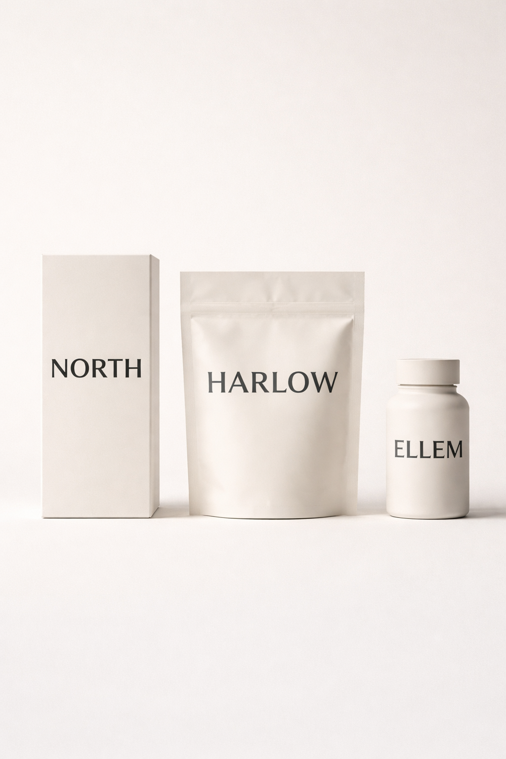
Typography-led packaging emerges as a response to cognition, not taste. It is a performance decision rooted in perception psychology, reading behavior, and trust formation. By 2026, many of the most effective packages are those that can survive visual reduction, sometimes to nothing more than a name, without losing recognizability or authority. Typography stops explaining the brand and starts being the brand.
In retail environments, consumers rarely look at packaging in a conscious, analytical way. They skim. They scan. They eliminate. The brain operates in a mode closer to pattern rejection than pattern appreciation. In this mode, visual systems optimized for interpretation and complex logos, symbolic metaphors, decorative illustrations become cognitively expensive.
Typography behaves differently. Humans are trained readers long before they become conscious consumers. Years of exposure to written language create specialized neural pathways that allow letterforms to be processed rapidly and almost automatically. Familiar typographic structures are recognized faster than abstract shapes, even when viewed briefly or peripherally.
A logo asks the brain to identify a symbol, match it to memory, and then attach meaning. A word collapses those steps. It delivers meaning directly. On a shelf where attention windows often last less than two seconds, this difference becomes decisive. Typography reduces cognitive friction at exactly the moment when friction is most damaging.
This is why typography increasingly becomes the first element noticed, not the last one read. It is also why brands that rely heavily on symbolic systems often struggle to maintain clarity across crowded shelves and compressed digital formats. Typography does not require interpretation. It requires recognition. and recognition is faster.
Traditional branding systems rely on visual memory: shapes, colors, icons, and symbols stored as images. These systems work best in stable contexts where exposure is repeated and attention is available. Modern packaging, however, exists across fragmented environments, physical shelves, mobile screens, e-commerce thumbnails, delivery boxes, and post-purchase touchpoints, where context constantly shifts.
Typography-led packaging moves identity from visual memory into verbal memory. A brand name stored as language is recalled differently than an image. It survives reduction, translation, and reproduction more reliably. Even when color disappears or layout collapses, the name remains legible and meaningful.
In 2026, this shift becomes strategic. Brands increasingly need identity systems that remain intact when stripped down to essentials. Typography provides that structural resilience. It allows identity to persist even when everything except the name is removed.
This is why typography-led packaging is not minimalism for its own sake. It is a move toward linguistic identity, where the brand exists first as language and only secondarily as image.

Trust is not created by decoration alone. It emerges from clarity, consistency, and perceived intention. Typography plays a central role because humans subconsciously infer meaning from letterforms before consciously reading them.
Stroke weight, spacing, rhythm, and proportion all function as psychological signals. Heavier letterforms communicate stability. Slight irregularities suggest human authorship. Overly refined geometry increasingly signals automation rather than care.
As generative design becomes ubiquitous, people develop a sensitivity to its visual signatures: perfect symmetry, frictionless curves, mathematically balanced layouts. These qualities, once associated with precision, now often signal speed and scale. Typography that feels too perfect can feel emotionally distant.
In response, brands introduce controlled imperfection, not as ornament, but as evidence of decision-making. Subtle inconsistencies in type act as trust cues. They signal that a human accepted constraints, made choices, and left traces of intent. Typography earns trust not by being expressive, but by feeling considered.

Typography-led packaging also aligns closely with the broader shift toward human packaging design. As brands move away from frictionless, machine-perfect aesthetics, typography becomes one of the most effective ways to reintroduce human presence without relying on illustration or decoration.
Letterforms carry traces of decision-making: spacing that feels intentional, weight that feels chosen, irregularities that feel accepted rather than corrected. In this sense, typography does not simply label the package, it signals authorship. Where human packaging design emphasizes tactility, imperfection, and emotional legibility, typography provides a linguistic equivalent: a visual language that feels made, not generated.
This is why typography-led systems often feel warmer and more trustworthy, even when they appear restrained. They communicate that someone cared enough to decide how the brand should speak.
The dominant typographic characteristics of 2026 are often described as trends, but they are better understood as functional responses to human perception.
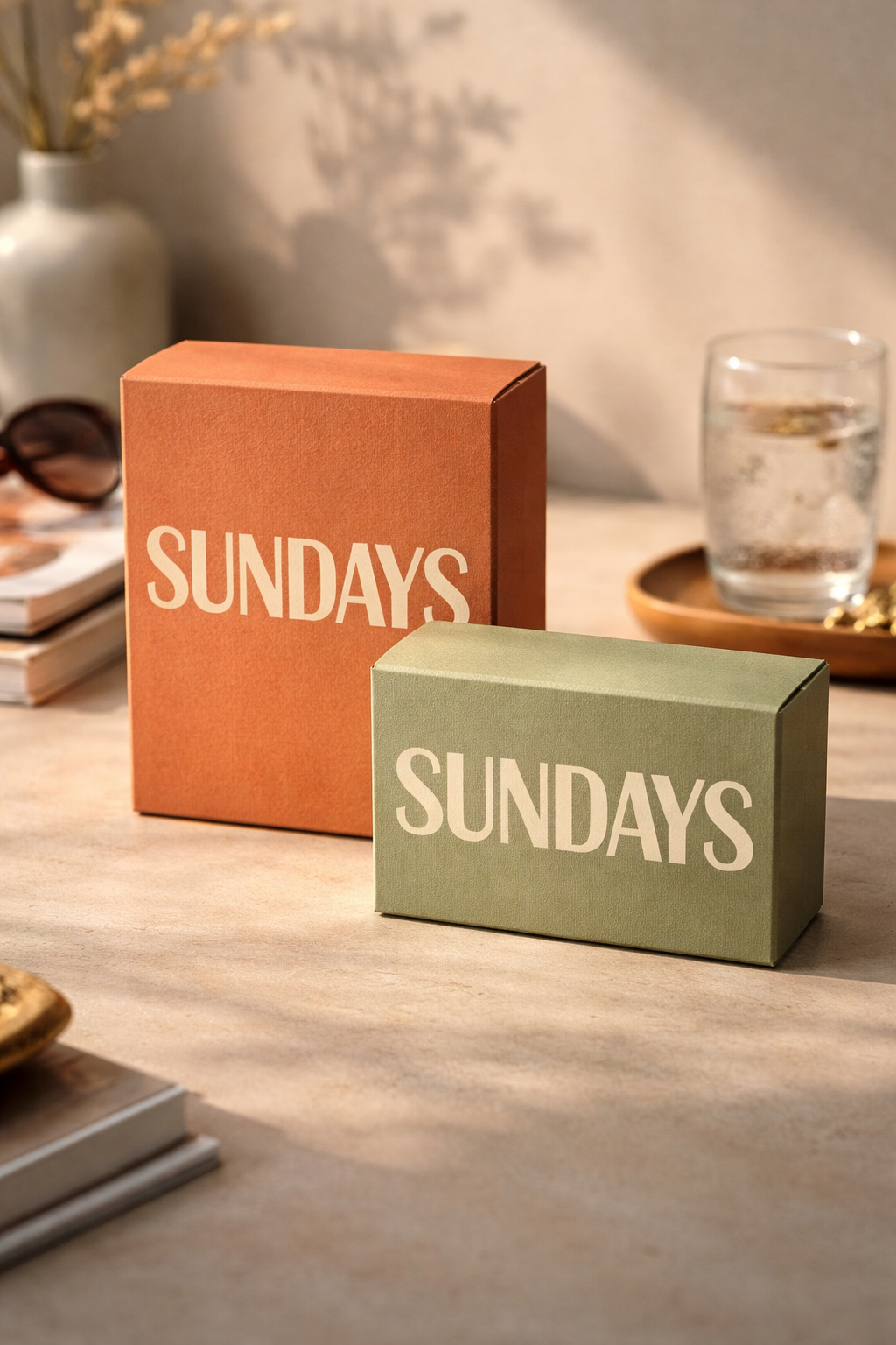
Chunky, confident letterforms perform better under real-world conditions. Thin type collapses under glare, distance, and compression; heavier type holds. This makes bold typography a performance choice rather than a stylistic preference.
Custom and semi-custom typefaces gain importance because they embed identity into structure. A proprietary typeface is harder to imitate than an illustration style and easier to apply consistently than a logo system. Over time, recognition shifts from the logo to the letterforms themselves.
Slight irregularities matter because they counter visual monotony. When everything is optimized for balance, balance loses meaning. Imperfection reintroduces tension, and tension holds attention. Typography that feels constructed rather than generated restores a sense of authorship.
Typography-led packaging prioritizes reliability over expression. Its strength lies in its ability to perform consistently across environments without constant redesign.
On shelves, typography anchors attention quickly. On screens, it survives compression. After purchase, it reinforces identity without requiring visual reinforcement, especially in connected packaging contexts. Each exposure reduces cognitive effort and strengthens recognition.
From a strategic standpoint, typography also offers stronger protection than illustrative systems. While visual styles can be copied and trends replicated, typography, especially custom type, creates structural differentiation. It embeds identity into the system itself rather than into surface decoration.

The following FAQ section is updated regularly to reflect changes in packaging design practice, consumer behavior, and brand strategy.
What does “typography-led packaging” mean?
Typography-led packaging refers to packaging design where the brand’s letterforms, its name and typographic system, serve as the primary identity element, rather than logos, illustrations, or decorative graphics.
Why is typography more effective than logos in 2026?
Typography aligns more closely with human cognition. Words are processed faster than symbols, remembered more reliably across contexts, and remain legible under compression in both physical and digital environments.
Is typography-led packaging the same as minimalist packaging?
No. Typography-led packaging is not about removing elements for aesthetic simplicity. It is about shifting identity into language and structure so the brand remains recognizable even under visual reduction.
Do brands still need logos if typography leads?
Many brands still use logos, but in a secondary role. In typography-led systems, the name and typeface carry recognition first, while logos act as supporting or contextual elements.
How does typography-led packaging support brand consistency?
Typography scales predictably across SKUs, markets, and platforms. A consistent type system reduces fragmentation and allows brands to maintain recognition even as formats, colors, or materials change.
Typography-led packaging marks a shift from visual persuasion to cognitive alignment. It accepts that attention is scarce, that decisions are fast, and that trust is built through clarity rather than excess.
When typography becomes the primary brand signal, identity no longer depends on interpretation. It depends on recognition. And recognition grounded in language, not imagery, survives change.
By 2026, the strongest packages are not those with the most elements, but those that remain recognizable when everything unnecessary is removed. If the name alone can carry the brand, the system is mature.
Last updated: January 2026
SOURCES:
(1)https://www.researchgate.net/publication/271158569_Reading_in_the_brain_by_Stanislas_Dehaene
(2)https://pmc.ncbi.nlm.nih.gov/articles/PMC6898452/
(3)https://www.eneuro.org/content/11/7/ENEURO.0228-24.2024
(5)https://www.mdpi.com/2304-8158/11/9/1183
.svg)