Packaging Marketing & Design Trends 2026 - An AI-Informed Analysis by Inuru
Human packaging design refers to a visual and material approach that intentionally uses tactile cues, illustration, expressive typography, and visible imperfection to signal authorship, care, and emotional presence.
Packaging design does not change because tastes shift. It changes when existing visual systems stop working. By 2026, many categories reach a saturation point where algorithmically optimized aesthetics: perfect gradients, flawless symmetry, and generative polish, no longer improve recognition or trust. Instead, they dissolve into a uniform visual field.
AI dramatically accelerates design production, but it also compresses visual diversity. When brands rely on similar prompts, datasets, and optimization logic, outputs converge. On shelves and in digital feeds, packaging becomes increasingly interchangeable. The very tools designed to optimize performance begin eroding differentiation.
As generative tools become more visible in everyday design, people begin to form mental shortcuts around them. AI-generated visuals are increasingly associated with speed, scale, and optimization rather than care or commitment. Over time, this association shifts how polish itself is interpreted.
Human packaging design emerges here not as nostalgia, and not as a rejection of technology, but as a correction. The goal is not to look handmade for its own sake. The goal is to restore signals of judgment and intention.
Where AI-generated packaging optimizes for smoothness and efficiency, human packaging design optimizes for recognition and emotional credibility. Irregularity, restraint, and visible choice imply authorship. They suggest that someone selected this form, this texture, this mark rather than generating infinite variations at scale. In an environment saturated with optimized visuals, these cues become legible again.
Human-centered design works because it aligns with how people actually evaluate products. Packaging is rarely read in detail. It is assessed. Under time pressure, consumers rely on fast, pre-verbal signals to decide what feels trustworthy, familiar, or worth a second look.
Texture, softened contrast, illustration, and expressive typography register faster than messages or claims. These cues interrupt repetition without shouting. On shelf, they break pattern recognition. In digital contexts: marketplaces, social feeds, search results, the same cues survive scale reduction, remaining legible when hyper-polished designs often collapse into visual noise.
From a psychological perspective, these human cues reduce cognitive load. When visual information feels familiar, textured, or expressive, it is processed more fluently, something people subconsciously interpret as trustworthiness. In high-speed decision environments, fluency often matters more than novelty.
This effect is amplified by how people now interpret automated outputs. When a design looks system-generated, viewers subconsciously assume lower human involvement, which reduces perceived accountability. Human cues counter this assumption by making authorship visible again.
For brands, this changes how differentiation is achieved. Instead of competing on novelty or surface polish, human packaging design competes on recognizability and trust under constraint. The constraint may be distance, speed, or screen size, but the outcome is consistent: designs that feel human are easier to remember and safer to choose.

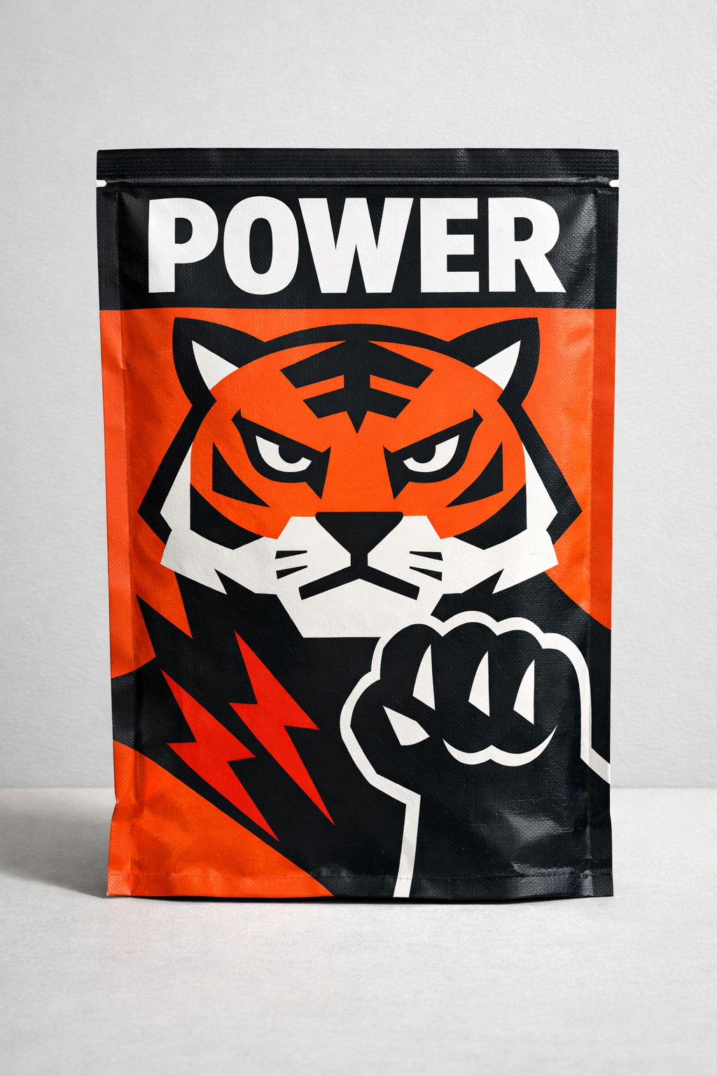
Illustration returns in 2026 not as decoration, but as resistance to algorithmic predictability. Unlike photorealistic imagery or generative visuals, illustration carries a visible point of view. It is difficult to standardize convincingly and difficult to automate without flattening its meaning.
The most effective uses share clear characteristics. They rely on flat, bold, symbolic forms rather than detailed realism. Characters have attitude rather than generic friendliness. Cultural references are present but restrained, avoiding irony overload. Most importantly, forms remain legible at small sizes, allowing them to function across shelves, thumbnails, and social crops.
Mascots and symbols return for the same reason. In crowded categories, they act as identity anchors. They are remembered even when brand names are not. Crucially, these characters are no longer cute by default. They are confident, sometimes slightly strange, and unmistakably specific.
Psychologically, symbols and characters are easier to store and retrieve from memory than abstract layouts or typographic systems. A consistent illustrated element creates a mental shortcut, allowing recognition to happen without conscious effort. This is why mascots often outperform wordmarks in crowded visual environments.
This specificity is what gives them power. Algorithms optimize toward averages. Illustration escapes them.
Over time, illustration functions less as a surface treatment and more as a system. Meaning accumulates through repetition rather than explanation. A symbol or character becomes familiar, emotionally loaded, and trusted without requiring narrative volume. In this sense, illustration becomes infrastructure for recognition.
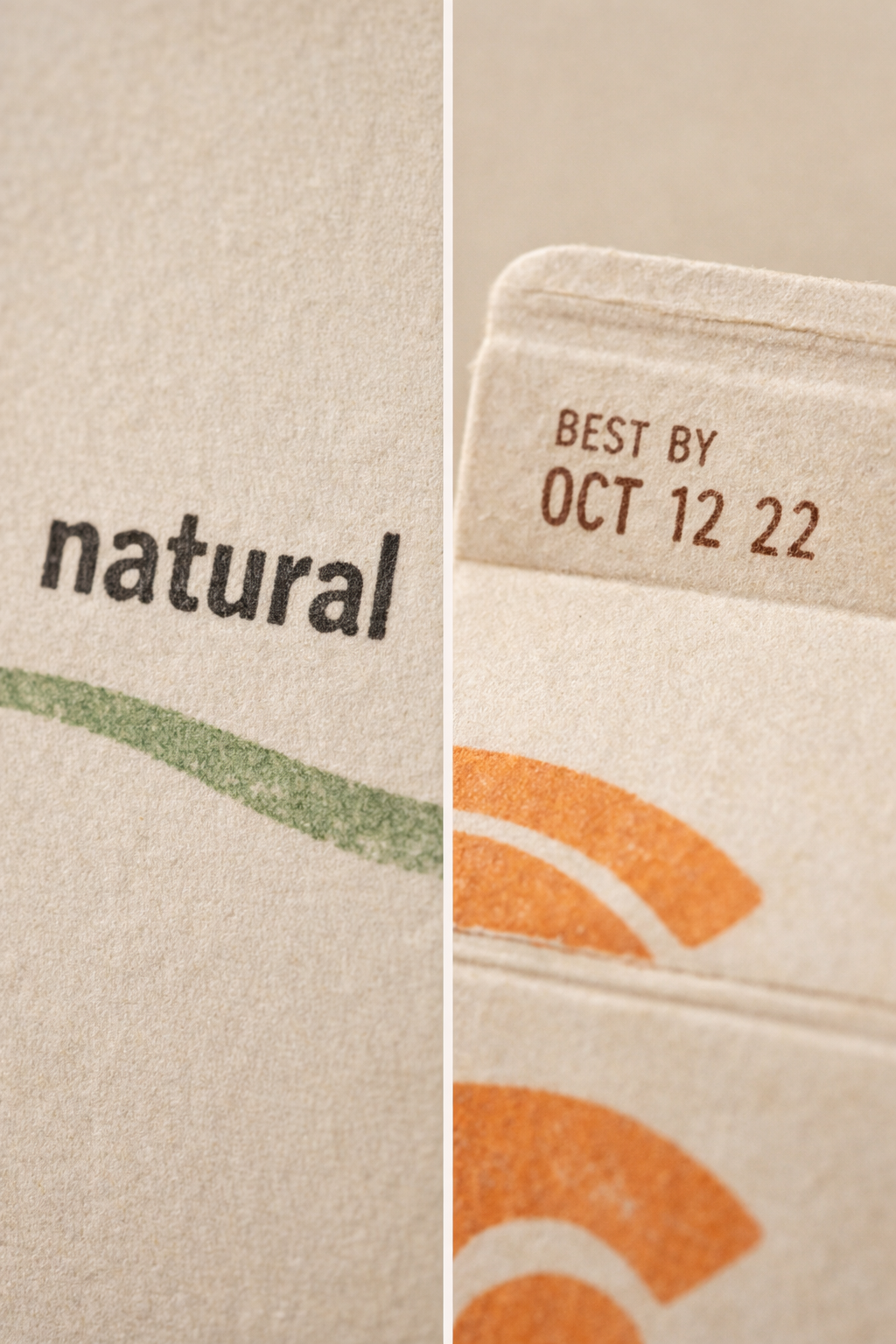
Even when materials remain cost-efficient, packaging in 2026 increasingly communicates tactility visually. This reflects a well-established principle of design psychology: texture equals trust.
Visual cues such as grain, noise, paper-like overlays, ink density variation, imperfect edges, and softened contrast introduce friction into otherwise smooth compositions. They do not simulate luxury materials. They suggest care, restraint, and material awareness.
From a perception psychology standpoint, visual cues associated with materiality and touch activate expectations of quality and care even when no physical interaction occurs.
In a visual environment dominated by sterile smoothness, texture creates presence. It slows the eye just enough to be noticed and assessed, rather than skipped.
In 2026, imperfection is no longer decorative. It is intentional. Brands are not adding roughness for nostalgia or craft theater. They are using it to escape visual automation.
Visual tactility counters two structural weaknesses of AI-driven aesthetics: sterility and disposability. When everything appears perfect, nothing feels lasting. Texture and irregularity reintroduce a sense of permanence without increasing production complexity.
For brands, this enables perceived quality gains without heavier substrates or expensive finishes. Value is created through perception rather than cost, which makes human-centered design particularly relevant in categories facing margin pressure or sustainability constraints. Importantly, tactile cues also age well. While layout conventions and color palettes cycle quickly, texture tends to feel grounded rather than dated.
Human packaging design is not about looking unfinished.
It is about looking chosen.
That distinction is subtle but decisive.
The following FAQ is updated regularly to reflect changes in design practice, technology, and market behavior.
What is human packaging design?
Human packaging design is an approach that uses tactile cues, illustration, expressive typography, and intentional imperfection to signal authorship, care, and emotional presence in contrast to AI-generated visual sameness.
Why does human packaging design increase consumer trust?
Because texture, irregularity, and human cues imply intention and accountability. Visually, they suggest that design choices were made deliberately rather than automatically.
Is human packaging design a rejection of AI tools?
No. It rejects AI-driven visual sameness, not technology itself. Many human-centered designs are digitally produced but intentionally avoid AI-generic aesthetics.
Do mascots and illustration work in all categories?
Not universally, but they perform strongly in crowded categories where recognition, memorability, and emotional anchoring matter more than minimalism.
Does human packaging design increase production cost?
Not necessarily. Many tactile cues are visual rather than material, allowing brands to increase perceived quality without heavier substrates or premium finishes.
As AI accelerates design production, differentiation shifts away from capability and toward judgment. The question is no longer whether a brand can generate visuals quickly. It is whether the brand knows what not to generate.
Human packaging design introduces limits where automation tends toward excess. It resists smoothness, uniformity, and infinite variation. In doing so, it restores meaning to visual decisions. Choice becomes visible again.
This does not signal the end of AI in design. It marks a new phase in which technology recedes into the background and intent becomes legible. The most effective packaging in 2026 will not announce its process. It will communicate presence. As AI becomes a default production layer, people stop evaluating whether something could be generated and start asking whether it was considered.
In an era of endless generation, the strongest signal is restraint. The most human packaging will not look imperfect by accident. It will look deliberate because someone decided it should.
Last updated: January 2026
SOURCES:
(1)https://www.nngroup.com/articles/aesthetic-usability-effect/
(2)https://www.mckinsey.com/capabilities/tech-and-ai/our-insights/the-business-value-of-design
(3)https://www.nngroup.com/articles/principles-visual-design/
(4)https://hbr.org/2015/09/design-thinking-comes-of-age
(5)https://mitsloan.mit.edu/ideas-made-to-matter/study-gauges-how-people-perceive-ai-created-content
(6)https://myscp.onlinelibrary.wiley.com/doi/full/10.1002/jcpy.1413
(7)https://link.springer.com/article/10.1007/s11747-021-00783-1
(8)https://www.smashingmagazine.com/2016/09/reducing-cognitive-overload-for-a-better-user-experience/
.svg)


