
Luxury spirits packaging is the coordinated design of a premium spirit’s bottle, label, closure and secondary packaging to communicate value and make the brand instantly recognisable. It creates a consistent identity across retail, hospitality, gifting and limited editions while supporting the presentation and experience of the spirit.
For premium spirits, packaging carries a significant part of the brand experience. The bottle may be discovered on a retail shelf, displayed behind a bar, served at a table or presented as a gift, often long before the product itself can communicate its quality.
That makes recognition especially important. A well-designed bottle should remain identifiable across different environments, viewing distances and editions, even when colours, artwork or finishes change. The challenge is not simply to make spirits packaging look luxurious, but to create a visual system that people can consistently associate with the brand.
Spirits packaging has a particularly long relationship with the consumer. Unlike many products that are removed from their packaging immediately after purchase, a bottle often remains visible throughout the entire experience. It may first be encountered on a retail shelf or in duty free, later displayed at home or behind a bar, served at a table and eventually kept as part of a collection or reused as a decorative object.
This gives the packaging several roles at once. Before the spirit is tasted, the bottle has to communicate positioning, quality and character. At the same time, it needs to remain recognisable in environments where customers may only see it briefly or from a distance. Once the bottle is picked up, smaller details such as typography, texture, label construction, finishing and closure design can add another layer to the experience.
The way spirits are sold also makes recognition particularly important. Premium bottles are often presented alongside products with similar price points and similar visual codes. Dark glass, metallic details, embossed labels, substantial closures and carefully controlled typography are common across the category. These elements can communicate quality, but they do not automatically make one brand distinctive from another.
A spirits bottle therefore has to achieve more than a premium appearance. It needs to create a recognisable identity that can survive different viewing conditions and different expressions of the brand. A bottle may need to look consistent across its core range, a limited edition, a travel-retail exclusive and a gift format without becoming repetitive or losing the cues that make it identifiable.
This is why luxury spirits packaging is best considered as a connected system rather than a collection of individual decorative choices. Bottle shape, label architecture, closure, typography, graphic assets and secondary packaging all influence recognition, building on the broader principles of luxury packaging. When these elements reinforce one another, the brand can evolve its packaging while maintaining a clear visual identity.
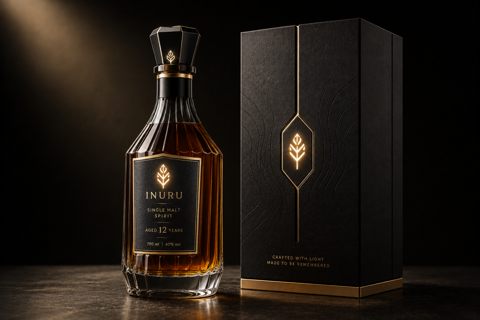
This is why luxury spirits packaging is best considered as a connected system rather than a collection of individual decorative choices. Bottle shape, label architecture, closure, typography, graphic assets and secondary packaging all influence recognition, building on the broader principles of luxury packaging. When these elements reinforce one another, the brand can evolve its packaging while maintaining a clear visual identity.
This is why luxury spirits packaging is best considered as a connected system rather than a collection of individual decorative choices. Bottle shape, label architecture, closure, typography, graphic assets and secondary packaging all influence recognition, building on the broader principles of luxury packaging. When these elements reinforce one another, the brand can evolve its packaging while maintaining a clear visual identity.
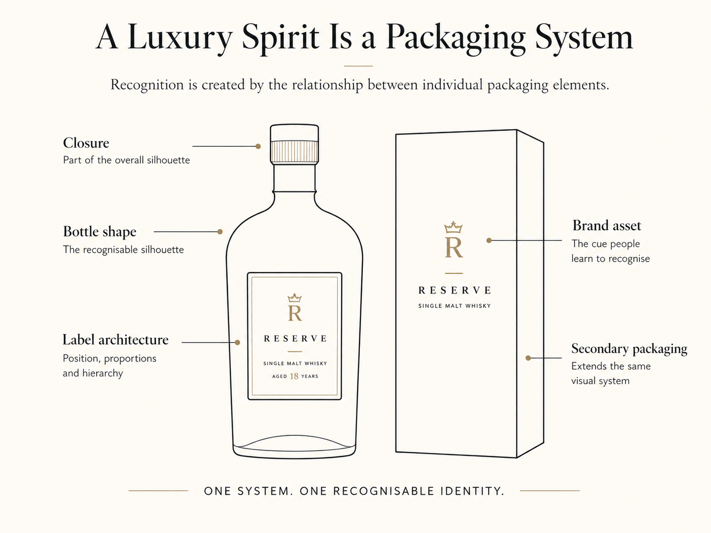
A luxury spirits package is rarely defined by one element alone. The bottle, label, closure and secondary packaging all contribute to the way the brand is recognised, and the relationship between them is often more important than any individual finish or decorative detail.
The bottle usually creates the strongest overall shape. Its proportions, shoulders, neck and base can establish a silhouette that remains recognisable even when labels or artwork change. For established brands, this structural consistency can become one of the most valuable visual assets because it works before a consumer has read a single word.
The label adds another layer of identity. Its size, position, proportions and relationship with the bottle create a visual architecture that can remain consistent across a product range. Typography, emblems and graphic elements can then change in controlled ways without disrupting the basic structure people already associate with the brand. This becomes especially useful when developing new expressions, age statements or limited editions.
Closures and neck details also play a larger role in spirits packaging than they might in many other categories. A distinctive cap, stopper or neck treatment contributes to the bottle’s silhouette and can help create continuity across different products. These details may seem secondary when viewed individually, but together they influence how quickly a bottle can be identified.
Secondary packaging should extend the same system rather than introduce an unrelated visual identity. A rigid box, carton or presentation case can use the same proportions, symbols, colours or graphic cues as the bottle without simply copying its artwork. The objective is to make the transition from outer packaging to bottle feel deliberate and connected.
When these elements are designed as one system, the brand gains more flexibility. Artwork can evolve, finishes can change and new editions can be introduced without losing recognition. Instead of relying on a single decorative feature to communicate luxury, the packaging builds identity through a consistent set of visual relationships.
One of the most important decisions in luxury spirits packaging is deciding which visual element should carry the strongest part of the brand identity. A bottle can contain many premium details, but recognition becomes weaker when every element competes for equal attention.
For some brands, the bottle silhouette does most of the work. For others, recognition may come from a distinctive label shape, an emblem, a wordmark, a signature colour or a particular closure. The strongest cue will depend on the brand, but it should be clear enough to remain identifiable even when the surrounding design changes.
This matters because consumers do not always encounter packaging under ideal conditions. A bottle may be viewed briefly on a shelf, partially obscured behind a bar or seen in a photograph where only part of the design is visible. In those situations, small decorative details are less useful than a strong, familiar asset that can be recognised quickly.
Consistency strengthens that effect over time. When the same core visual cue appears across a range of products, consumers begin to associate it with the brand rather than with a single bottle. New colours, finishes or artwork can then be introduced around it without forcing the product to rebuild recognition from the beginning.
This is especially important for luxury spirits, where brands often need to balance heritage with change. Packaging may evolve to reflect a new release, collaboration or market, but the most recognisable elements should still provide continuity. The goal is not to make every bottle look identical. It is to make each one feel unmistakably part of the same brand.
Luxury spirits packaging has to remain effective at more than one viewing distance. A bottle may first be noticed from several metres away, then compared more closely on a shelf and finally examined in the hand. Each of these moments reveals a different part of the design, so the packaging needs to work as a hierarchy rather than depend on details that only become visible up close.
From a distance, the overall silhouette and the largest visual cues matter most. Bottle proportions, colour distribution, label placement and a strong emblem or wordmark are more likely to register than fine typography or subtle finishing. This is particularly relevant in hospitality and travel retail, where bottles may be viewed among many competing products and under changing lighting conditions.
At closer range, the label architecture becomes more important. Consumers can begin to distinguish the brand name, expression, age statement or other information, while the relationship between typography, graphics and negative space becomes easier to read. A strong design should reveal more information without losing the visual structure that made the bottle recognisable from further away.
Once the bottle is handled, smaller details can add depth to the experience. Texture, embossing, print quality, glass details and the feel of the closure can reinforce the level of care suggested by the overall design. These elements do not need to carry recognition on their own, but they can confirm the impression created at first glance.
Designing across these different distances helps prevent a common problem in premium spirits packaging: a bottle that looks impressive in a close-up presentation but becomes anonymous in a real environment. The strongest packaging retains a clear identity from afar and rewards attention as the consumer moves closer.
Luxury spirits brands often need to balance consistency with novelty. A core range should feel immediately recognisable, while limited editions, collaborations and travel-retail exclusives need enough freedom to feel new. The challenge is to introduce variation without weakening the visual identity that has already been built.
This is easier when a brand has clearly defined which elements are flexible and which act as recognition anchors. Artwork, secondary colours, decorative patterns and finishes can often change significantly between editions. Bottle silhouette, label proportions, a signature emblem, wordmark or closure may need to remain more stable because these are the elements consumers are most likely to associate with the brand.
The strongest limited editions usually create contrast around something familiar. A new illustration or material can feel more distinctive when it appears within an established structure. The edition gains novelty, but the customer can still understand immediately which brand it belongs to.
This also helps brands avoid a common problem: creating special editions that attract attention individually but gradually make the portfolio less coherent. If every release introduces a completely different visual language, the brand may gain short-term variety at the expense of long-term recognition.
Consistency does not mean repetition. It means preserving enough of the brand’s visual structure that new expressions still feel connected. For luxury spirits, this creates room to experiment with design while protecting the elements that make the bottle recognisable in the first place.
For many luxury spirits, the bottle is only one part of the overall presentation. Gift boxes, cartons, tubes and rigid cases can add another layer to the experience, particularly for premium releases, gifting occasions, travel retail and limited editions. In these cases, the customer may encounter the secondary packaging before seeing the bottle itself, which means both layers need to communicate the same brand identity.
The strongest systems create continuity without simply repeating the same artwork. A colour, emblem, proportion, material or graphic detail can move from the bottle to the outer pack in a different form, giving the two elements a shared visual language while allowing each to fulfil its own role. The outer packaging can create anticipation and provide more space for storytelling, while the bottle remains the central object once the pack is opened.
This relationship becomes especially important when the secondary packaging is more visually elaborate than the primary pack. A highly decorative presentation box may attract attention initially, but if it introduces a completely different identity, the bottle inside can feel disconnected from the experience that preceded it. The transition from outer packaging to bottle should feel intentional rather than like two separate design projects.
The opening experience also creates an opportunity to control how the brand is revealed. Rather than showing every element at once, secondary packaging can introduce the identity gradually through structure, internal graphics or carefully positioned details. When the bottle appears, familiar visual cues can provide continuity and make the reveal feel like a natural progression of the same design system.
Secondary packaging can also help organise a wider spirits portfolio. Consistent structures, proportions or opening mechanisms can create relationships between different expressions, while artwork, colours and finishing allow individual products to remain distinct. This is particularly useful when a brand needs to differentiate between its core range, premium tiers and special releases without creating completely separate identities.
The important point is that secondary packaging should strengthen recognition rather than compete with it. The box can add ceremony, protection and storytelling, but the visual cues that make the spirit identifiable should remain present throughout the experience. When primary and secondary packaging work together, the customer moves from outer pack to bottle without losing the sense of which brand they are interacting with.
Premium spirits packaging often relies on a familiar set of visual signals. Heavy bottles, dark colour palettes, metallic details, textured papers, embossed labels and substantial closures can all communicate quality. These cues are effective because consumers already associate them with higher-value products.
The problem is that the same language is used across much of the category. When many brands rely on similar materials, finishes and visual conventions, the packaging may still look premium while becoming harder to distinguish. The consumer recognises the category, but not necessarily the individual brand.
This creates an important difference between premiumisation and distinctiveness. Premiumisation helps establish perceived value and positioning. Distinctiveness helps a customer identify one brand among many competing products. Strong luxury spirits packaging needs to achieve both rather than treating them as the same objective.
Adding more premium details is not always the answer. Another foil, texture or decorative element can increase complexity without improving recognition. In some cases, the stronger design decision is to simplify the surrounding packaging so that one distinctive asset becomes easier to notice and remember.
This is where a clearly defined brand system becomes particularly valuable. A recognisable bottle silhouette, label structure, emblem, colour relationship or closure can create continuity even when materials and finishes change. These elements give the brand something it can consistently own rather than relying entirely on conventions shared across the market.
For luxury spirits brands, the question therefore shifts from “How can we make this bottle look more premium?” to “Which part of this packaging should be unmistakably ours?” That change in perspective can lead to stronger long-term recognition because design decisions are evaluated not only by how refined they look, but also by how clearly they reinforce identity.
This does not mean abandoning traditional luxury cues. High-quality materials and finishes still play an important role in communicating value. The opportunity is to use them in support of a distinctive brand system rather than allowing them to become the system itself. A bottle can follow the visual codes of luxury while still creating an identity that competitors cannot easily replicate.
Interactive features can give luxury spirits packaging another way to create distinction, but they are most effective when they support an existing brand idea rather than introduce a completely separate one. The technology should have a clear role within the packaging system and strengthen the element the brand already wants consumers to notice.
This can take different forms. A familiar emblem might become illuminated during a presentation moment, a graphic element could respond to touch, or part of the label could reveal a visual effect only when activated. In each case, the interaction works best when it builds on something already present in the design rather than adding a new visual language.
For luxury brands, restraint is especially important. Interaction does not need to be constant or highly animated to create impact. A short, controlled response can feel more considered because it preserves the appearance of the bottle in its passive state and introduces the effect only when it adds something to the experience.
The context also matters. An interactive element may serve a different purpose in hospitality than it does in gifting or a limited edition. Behind a bar, it may help reinforce recognition in lower light. At the table, it can become part of the presentation. In a gift format, it may support the reveal. The same technology can therefore have very different value depending on when and where it is experienced.
The key question is whether the interaction makes the brand more recognisable or simply makes the packaging more noticeable. Those are not always the same thing. If the effect draws attention away from the bottle’s established identity, it may create novelty without strengthening the brand. If it emphasises a signature element, it can extend recognition into a new sensory layer.
This is where illuminated packaging can become relevant. Thin printed OLEDs can be integrated into selected areas of a label or pack, allowing an existing logo, outline or graphic detail to become active without redesigning the entire visual system. Used selectively, light can reinforce the hierarchy that is already present rather than compete with it.

A strong luxury spirits packaging concept should be evaluated as a complete brand system rather than as a collection of individual design choices. Before refining materials, finishes or interactive elements, it helps to define which parts of the packaging are responsible for recognition and which can change over time.
The first question is what the brand needs consumers to recognise immediately. This could be the bottle silhouette, a wordmark, an emblem, a colour relationship, a label structure or another distinctive element. Once that recognition anchor is clear, the rest of the design can be built around it instead of competing for equal attention.
The next consideration is where the bottle will be seen. Packaging that works in close-up photography may behave differently on a retail shelf, in duty free or behind a bar. Evaluating the design across several viewing distances helps reveal whether the strongest brand cues remain visible when finer details disappear.
Brands should also separate permanent elements from flexible ones. Core recognition assets usually benefit from consistency, while artwork, finishes, secondary colours and campaign graphics can change more freely. This makes it easier to develop limited editions and special releases without weakening the visual identity of the wider portfolio.
Primary and secondary packaging should then be reviewed together. The outer pack can add storytelling, ceremony and protection, but it should still lead naturally back to the bottle. Shared proportions, graphic cues, colours or symbols can create continuity without requiring both layers to look identical.
Finally, any interactive feature should have a clear role. The question is not simply whether the packaging can respond to touch, movement or light, but what that response contributes to recognition, presentation or the overall experience. If the effect reinforces an existing brand asset, it can become part of the system. If it introduces an unrelated visual idea, it may add novelty without adding identity.
This framework keeps the focus on a simple objective: creating packaging that can evolve without becoming unfamiliar. Luxury spirits brands need room for new editions, markets and experiences, but the strongest systems preserve enough continuity that the product remains recognisable throughout those changes.
Luxury spirits packaging is most effective when recognition is considered from the beginning of the design process. The bottle, label, closure and secondary packaging should work together as one system, creating an identity that remains clear across different environments, product ranges and presentation formats.
Premium materials and finishes still play an important role in communicating quality, but they cannot create distinctiveness on their own. When similar luxury cues appear across an entire category, brands need stronger visual assets that consumers can learn to recognise and associate with a specific product. Bottle silhouette, label architecture, colour, typography, emblems and closures can all contribute to that recognition when they are used consistently.
At the same time, consistency should not prevent a brand from evolving. Limited editions, collaborations, travel-retail releases and new expressions all create opportunities to introduce different artwork, materials or experiences. The strongest packaging systems allow these elements to change while preserving enough familiar cues to keep the brand immediately identifiable.
The same principle applies to newer forms of packaging interaction. Light, touch or other responsive elements can introduce another layer to the experience, but they are most valuable when they reinforce an existing part of the identity rather than compete with it. Innovation becomes more meaningful when it strengthens something consumers can already recognise.
For luxury spirits brands, the goal is therefore not simply to create a bottle that looks premium at launch. It is to build a packaging system that can remain distinctive as the portfolio grows, the environment changes and the brand continues to evolve. When recognition and flexibility are designed together, packaging can support both immediate impact and long-term brand value.
What is luxury spirits packaging?
Luxury spirits packaging is the coordinated design of a premium spirit’s bottle, label, closure and secondary packaging to communicate quality and create a recognisable brand identity. It brings structural, visual and tactile elements together so the product remains distinctive across retail, hospitality, gifting and different editions.
What makes spirits packaging look luxurious?
Luxury spirits packaging usually combines high-quality materials, precise execution, considered proportions and a clear visual hierarchy. Details such as glass quality, typography, closures, tactile labels and finishing can strengthen perceived value, but they work best when they support a coherent brand identity rather than simply adding decoration.
Why is packaging important for premium spirits?
Packaging shapes expectations before the spirit is tasted and often remains visible throughout the product experience. It can communicate positioning, reinforce brand recognition and help a bottle stand apart from competing products in retail, hospitality and gifting environments.
What makes a luxury spirits bottle distinctive?
Distinctiveness comes from visual cues that consumers can consistently associate with a particular brand. These may include bottle silhouette, label architecture, colour, typography, an emblem, a signature graphic element or a distinctive closure. Repetition of these cues over time helps build recognition.
How can spirits brands update packaging without losing brand recognition?
Brands can preserve their strongest recognition anchors while changing more flexible elements such as artwork, secondary colours, decorative finishes or campaign graphics. This allows the packaging to evolve while keeping the visual cues consumers already associate with the brand.
How should limited-edition spirits packaging differ from the core range?
Limited editions can introduce new artwork, materials, colours or presentation formats while retaining selected elements from the core packaging. Keeping features such as the bottle shape, wordmark, emblem or label structure helps the edition feel new without becoming disconnected from the wider brand.
Can luxury spirits packaging be interactive?
Yes. Luxury spirits packaging can incorporate touch, movement, light or other responsive elements. These features are most effective when they highlight an existing brand asset or support a specific presentation moment, rather than becoming a separate effect that competes with the bottle’s identity.
Last updated: August 2026
SOURCES:
(1)https://www.sciencedirect.com/science/article/abs/pii/S0022435916300811
(2)https://www.theiwsr.com/insight/premiumisation-is-slowing-but-theres-a-counter-trend/
(3)https://www.sciencedirect.com/science/article/abs/pii/S0148296319300360
(4)https://marketingscience.info/learn-with-us/commercial-research/distinctive-asset
(5)https://link.springer.com/article/10.1186/s41235-022-00391-9
(6)https://www.sciencedirect.com/science/article/pii/S0148296322003630
(7)https://www.sciencedirect.com/science/article/pii/S0969698926000809
(8)https://www.sciencedirect.com/science/article/abs/pii/S0148296323004368
.svg)


