
Luxury spirits labels perform differently in low-light environments because fine typography, subtle colours, embossing and reflective finishes can become harder to perceive as illumination decreases. Strong contrast, recognisable shapes and clearly prioritised brand elements remain easier to identify, while light-emitting details can preserve selected visual cues independently of ambient light.
Premium spirits labels are usually developed and approved under controlled lighting, where materials, finishes and fine details can be evaluated at their best. The environments in which many spirits are actually consumed are very different.
Bars, clubs and lounges introduce lower illumination, greater viewing distances, movement and constantly changing light. These conditions can alter which elements of a label are noticed first and which become difficult to read or recognise.
For premium spirits brands, this creates a practical design challenge. A label needs to preserve its identity not only in a studio or on a retail shelf, but also in the environments where the bottle is displayed, served, photographed and experienced.
Low light changes more than the overall brightness of a label. It changes the way the human visual system interprets colour, contrast, detail and shape, which means the hierarchy created under bright studio lighting may not be preserved once the bottle enters a darker environment.
This matters because luxury spirits labels often depend on subtle visual relationships. Fine typography, restrained colour palettes, metallic details, embossing and low-contrast finishes can communicate refinement in controlled conditions. In bars, clubs and lounges, however, those same elements may become less distinct, especially when the bottle is viewed from further away or under uneven ambient lighting.
As illumination decreases, the eye becomes less effective at distinguishing fine detail and subtle colour differences. Larger shapes, stronger tonal contrast and dominant brand elements are therefore more likely to remain perceptible than delicate decorative features. The design itself has not changed, but the way it is perceived has.
The surrounding environment can intensify this effect. Hospitality spaces rarely use one stable, neutral light source. Warm lighting, coloured LEDs, backlit shelves, reflections from glass and moving sources of light can all alter how a label appears. Metallic details may become highly visible from one angle and nearly disappear from another, while dark colours can merge more easily into the surrounding scene.
Distance also changes the balance between detail and recognition. A label that appears carefully structured at close range may lose much of its information when viewed from several metres away. At that point, bottle silhouette, label shape, contrast and one or two dominant brand cues begin to carry more of the visual identity.
For this reason, low-light performance cannot be judged simply by reducing the brightness of an artwork file or evaluating a sample under dimmer studio lighting. Human vision itself adapts as illumination changes, and that adaptation affects which wavelengths, colours and details are perceived most strongly.
Understanding that shift is important for label design because it explains why some premium details remain effective in darker environments while others become much less visible. To see why, it helps to look more closely at what happens to human vision as the lights go down.
Human vision does not operate in exactly the same way at every light level. As illumination decreases, the visual system gradually shifts between different modes of seeing, and that transition affects how brightness, colour and contrast are perceived.
Under bright conditions, vision is predominantly photopic. Cone cells in the retina are responsible for most visual processing, allowing relatively precise colour discrimination and detailed vision. This is close to the environment in which packaging is typically reviewed: well-lit offices, studios, retail displays or product photography.
At very low light levels, vision becomes predominantly scotopic. Rod cells play a much greater role, increasing sensitivity to low levels of light but providing very limited colour information. Between these two states lies mesopic vision, where both rods and cones contribute to what we see. The CIE describes mesopic vision as covering a broad intermediate range of luminance that is neither fully photopic nor fully scotopic.
This intermediate state is particularly relevant when thinking about packaging used in dim environments. The important difference is that the eye does not simply become less sensitive overall. Its spectral sensitivity changes. As illumination moves towards mesopic levels, visual sensitivity shifts towards shorter wavelengths, meaning that colours do not necessarily retain the same relative brightness they appear to have under brighter conditions.
This phenomenon helps explain why two visual elements that appear similarly bright in normal lighting can behave very differently once the environment becomes darker. The CIE notes that ordinary photopic measurements can give a misleading indication of perceived brightness at mesopic levels because they do not fully account for this shift in the eye's response. Red light provides a particularly clear example: its apparent brightness can fall more strongly than a conventional photopic measurement would suggest.
For packaging design, this means that colour cannot be treated as a fixed property of the artwork. A red emblem, a blue-green graphic element and a gold-toned detail may not preserve the same visual relationship as the surrounding illumination changes. The label remains physically identical, but the viewer's sensitivity to different parts of the spectrum is changing.
This is also why simply describing a nightclub or bar as “dark” is not enough. The exact perception of a label depends on the level of illumination, the spectral composition of the surrounding light, the colours used in the design and how adapted the viewer's eyes are to the environment.
Understanding photopic, mesopic and scotopic vision therefore gives designers a more useful framework for evaluating low-light packaging. Instead of asking only whether a label is visible, they can ask a more precise question: which parts of the label will retain their visual strength as the viewer moves from bright to progressively darker conditions?
The practical consequence of mesopic vision is that a luxury spirits label may not preserve the same visual hierarchy in a dim environment that it has under brighter conditions. Colour relationships can shift, subtle tonal differences can weaken and some brand elements may become less prominent than expected.
This is particularly relevant for dark premium palettes. Black, charcoal, burgundy, deep green and navy can create a sophisticated appearance under neutral lighting, but low-luminance combinations may lose separation as illumination decreases. If the brand name, emblem and background sit too close together in perceived brightness, the label can become visually flatter even though the colours themselves have not changed.
Spectral sensitivity adds another layer. As vision moves into the mesopic range, shorter wavelengths gain relative visual importance while longer wavelengths can appear less prominent. This means that colour decisions should not be judged only by how vivid or premium they look under bright light. A red or warm-toned brand cue, for example, may not retain the same apparent strength relative to cooler elements as the environment becomes darker.
Contrast therefore becomes one of the most reliable tools for preserving hierarchy. A clearly separated wordmark, emblem or graphic shape has a better chance of remaining identifiable when subtle colour differences become harder to distinguish. The goal is not to make every element high-contrast, but to ensure that the elements responsible for recognition are not dependent on delicate tonal relationships alone.
Typography should be considered in the same way. Fine serif details, narrow strokes and low-contrast lettering can contribute to a luxury aesthetic, but they should not be asked to carry too much recognition in low light. Important brand information benefits from enough scale, spacing and contrast to survive changes in viewing conditions, while finer typography can continue to reward closer inspection.
Material and surface treatments also interact with these perceptual changes. A matte label, metallic foil and glossy varnish may share similar colours in a design file but reflect very different amounts and directions of light once applied to the bottle. Under dim or directional lighting, those differences can become more important than the nominal colour values used in the artwork.
For luxury spirits labels, the useful design question is therefore not simply whether a colour or finish looks premium. It is whether the most important brand cue remains visually dominant after colour sensitivity, contrast and reflections begin to change. Mesopic vision turns low-light design into a question of hierarchy rather than brightness alone.
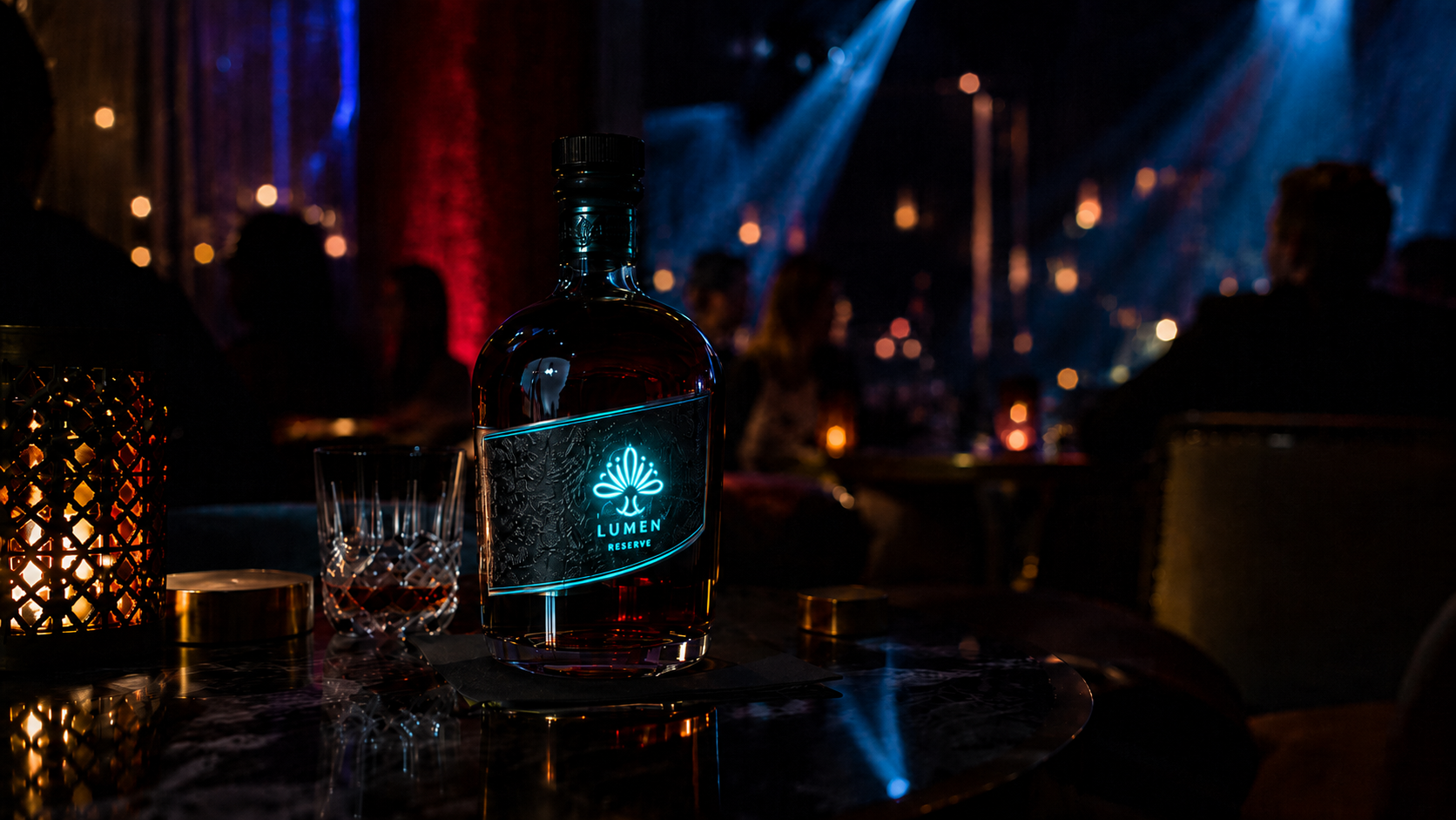
Reflective and light-emitting elements can both create visual emphasis, but they rely on fundamentally different mechanisms. Reflective finishes need external light to become visible, while light-emitting elements generate their own illumination. In low-light environments, that difference can significantly affect how consistently a brand cue is perceived.
Foil, metallic inks and glossy varnishes can produce strong highlights when they catch a direct light source. In the right position, this creates depth, movement and a premium effect that changes as the bottle is handled. The limitation is that the result depends on angle, surrounding illumination and the reflective properties of the surface. A detail that appears bright from one position may become much less noticeable after the bottle is rotated only slightly.
This variability is not necessarily a disadvantage. Reflective materials can create an elegant sense of movement because the visual effect changes as the bottle moves through the environment. For luxury spirits, that can add richness without making the packaging permanently conspicuous. The challenge is that reflection is difficult to use as the only mechanism for preserving a specific recognition cue in inconsistent lighting.
Light-emitting elements behave differently because the selected area does not need to wait for an external light source to become visible. A logo, emblem, outline or graphic detail can produce its own light, creating a more controlled point of attention even when the surrounding label remains dark.
However, emitted light introduces its own design considerations. Apparent brightness in low-light conditions cannot be understood only through a single luminance value. As vision moves into the mesopic range, the spectral sensitivity of the eye changes, meaning that two sources measured as similarly bright under photopic conditions may not appear equally prominent in a darker environment. The wavelength of the emitted light, the surrounding illumination and the viewer's adaptation state all influence the result.
This is particularly important when comparing different illuminated colours. A red illuminated detail and a cooler-toned element should not automatically be expected to have the same perceived strength simply because their measured luminance is similar. Low-light evaluation therefore needs to consider both photometric output and how that output is actually perceived under the intended conditions.
Reflective and emissive elements can also work together rather than compete. Foil or metallic details can provide texture and changing highlights when external light reaches the bottle, while a selectively illuminated element can preserve one important visual cue more consistently. This creates a hierarchy in which traditional finishes contribute richness and movement, while illumination provides a controlled point of recognition.
For luxury packaging, restraint remains important in both cases. If too many reflective or illuminated details compete for attention, the label can lose clarity. A stronger approach is to decide which element needs to remain visible, which details can appear only when the light catches them and which features are intended primarily for close inspection.
The useful question is therefore not whether reflective or light-emitting finishes are better. It is what each one is being asked to do. Reflection can create variation and material richness. Emission can preserve a selected cue independently of ambient light. When those roles are defined clearly, both can support a premium label without overwhelming its visual identity.
Low-light perception is only one part of the challenge. Luxury spirits labels are rarely viewed from a fixed position, and the way a design performs can change significantly as the bottle moves through space.
Distance affects which parts of the label remain available to the viewer. From several metres away, fine typography, embossing and small decorative details contribute very little to recognition. Larger shapes, label proportions, colour blocks and dominant brand cues carry more of the visual identity. As the viewer moves closer, additional information becomes available and the role of finer details increases.
Viewing angle changes the picture again. Curved glass, metallic finishes and glossy surfaces can behave very differently depending on where the light source sits relative to the bottle. A foil detail may become highly visible for a moment and then disappear as the bottle rotates, while reflections from glass can temporarily obscure parts of the label.
Movement reduces the time available to process those changes. In hospitality environments, bottles may be carried, poured, turned or passed between people rather than displayed perfectly front-facing. The viewer may only receive a short visual impression, which makes stable recognition cues especially important.
Partial visibility creates another practical constraint. Bottles positioned behind other products, placed in ice buckets or handled during service may expose only part of the front label. If brand recognition depends on one small central detail, that cue may be lost. A stronger design can preserve identity through more than one element, such as label shape, colour relationship, emblem or bottle structure.
These conditions also influence how reflective and illuminated details should be evaluated. A reflective finish may work beautifully during movement because the changing angle creates flashes of light. An illuminated element may remain more stable, but its placement still matters if parts of the label can be obscured or turned away from the viewer.
For this reason, low-light label performance should be assessed dynamically. The relevant question is not only how the bottle looks when positioned correctly under one light source, but whether its most important visual cues remain identifiable as distance, angle and movement change.
Low-light performance now matters in two different ways: how the label appears to the human eye and how it appears through a smartphone camera. Those two views are not identical.
Modern phones actively process low-light scenes. Exposure, noise reduction, sharpening, tone mapping and colour correction can all change the appearance of the bottle compared with what someone sees in person. A label that looks balanced in the room may therefore appear darker, flatter, more reflective or more contrast-heavy on screen.
Reflective finishes can be particularly unpredictable. Foil, glossy varnish and glass reflections may create strong highlights under one camera angle and disappear under another. Automatic exposure can also react to bright points in the scene, causing darker parts of the label to lose detail.
Illuminated elements introduce the opposite problem. A small light-emitting detail may remain visible to the eye, but if it is too bright relative to the surrounding bottle, a smartphone can overexpose the illuminated area and remove the logo or graphic detail it was meant to reveal. Visibility therefore depends not only on whether the element emits light, but on whether the camera can preserve its shape and detail.
Colour can shift as well. Nightlife environments often combine warm ambient light with blue, red, violet or green sources. Smartphone white-balance and image-processing systems may attempt to neutralise or reinterpret these conditions, so brand colours can appear differently across devices and even between still images and video.
Movement adds another complication. A bottle being carried or poured may be captured for only a fraction of a second. Motion blur, changing exposure and rapid shifts in angle reduce the amount of label information that survives. In these situations, larger recognition cues are more likely to remain identifiable than small text or delicate finishing.
This means low-light testing should include ordinary smartphone photography and video rather than relying only on professional product photography. The bottle should be tested at realistic distances, while stationary and moving, and under the same types of mixed lighting likely to be present in the intended venue.
The goal is not to design packaging for the camera instead of the person holding the bottle. It is to make sure the same core identity survives both experiences. In nightlife, a luxury spirits label may be seen in the room for seconds but remain visible in photos and videos much longer.
Low-light performance is difficult to judge from artwork files, renderings or brightly lit sample reviews. A label should be tested on the finished bottle, under conditions that reproduce as closely as possible the environments in which the product will actually be displayed, served and photographed.
The first step is to evaluate the complete pack rather than the label alone. Glass colour, bottle shape, liquid tone, curvature and surface reflections can all influence how the artwork is perceived. A design that appears balanced on a flat proof may behave differently once it is wrapped around glass and viewed through or against the liquid inside.
Testing should then move through several levels of illumination rather than relying on a single “dark” setting. A useful review can include bright neutral light, lower ambient light and more demanding mixed-light conditions that resemble bars, lounges or clubs. This helps reveal when colour relationships begin to weaken and which brand cues remain stable as the visual system moves away from bright photopic conditions.
Spectral composition matters as well. Warm white light, cool white light and coloured ambient sources can affect the same label differently. A design containing red, blue, green or metallic elements should therefore be checked under more than one type of lighting, particularly if the intended environment uses strong coloured LEDs or decorative lighting.
Distance should be tested deliberately. The bottle can first be reviewed in the hand, then at typical shelf or table distance and finally from several metres away. Each position answers a different question. Close viewing reveals finishing quality and detail, while greater distance shows whether silhouette, label structure and the main recognition cue continue to carry the identity.
The test should also include movement and changing viewing angles. Rotating the bottle can reveal how foil, gloss and glass reflections behave, while carrying or pouring it shows how much information remains available during brief exposure. This is particularly useful for determining whether a visual effect works only in one ideal position or remains effective under more realistic conditions.
Any illuminated element should be evaluated separately for perceived brightness, colour and legibility. It is not enough to confirm that the light is visible. The illuminated logo, outline or graphic should retain its intended shape without dominating the rest of the bottle, disappearing against surrounding light or becoming overexposed in a camera image.
Finally, the same sequence should be repeated with a smartphone. Still photographs and short video clips can reveal glare, colour shifts, exposure changes and loss of illuminated detail that may not be obvious to the eye. Testing across more than one device can be useful when camera performance is an important part of the intended brand experience.
A practical low-light test therefore asks more than whether the bottle can be seen. It checks whether the intended hierarchy survives changes in illumination, spectrum, distance, angle, movement and camera processing. The result should be a label that preserves the right brand cues even when the environment becomes much less controlled.
A luxury spirits label should not generate its own light simply because the bottle will be used in a dark environment. Illumination is most useful when there is a specific brand element that needs to remain perceptible even as ambient light, viewing angle and colour sensitivity change.
That distinction matters because low-light visibility is not only about brightness. As the eye moves into mesopic vision, spectral sensitivity changes and different colours can lose or gain relative prominence. An illuminated detail therefore needs to be evaluated not only by its measured output, but by how clearly it preserves the intended brand cue under the actual conditions in which the bottle will be seen.
The most effective applications are usually selective. A logo, emblem, outline or graphic detail can be illuminated while the rest of the label remains passive. This allows the brand to preserve a controlled hierarchy rather than turning the entire bottle into a light source. The illuminated state should feel like an extension of the existing design, not a separate visual identity.
Colour choice also matters. Two illuminated elements with similar measured luminance may not appear equally bright in a dim environment if they emit different wavelengths. This is one reason why low-light evaluation should include real-world visual testing rather than relying only on technical specifications or studio measurements.
Brightness needs the same restraint. In dark surroundings, a relatively small illuminated area can already attract significant attention. If the effect is too intense, it can overpower the rest of the packaging, create glare or become difficult for smartphone cameras to capture without overexposure. The objective is to preserve recognition, not maximise output.
Activation should also be designed around the intended moment. Constant illumination may be appropriate in some applications, while touch, movement, sound or timed activation can create a shorter and more deliberate response. For luxury spirits, controlled activation can make the effect feel connected to presentation or interaction rather than functioning as permanent decoration.
The passive state remains equally important. When the light is off, the bottle should still work as luxury packaging. Materials, typography, label structure and brand hierarchy should remain coherent on their own. Illumination should strengthen an already recognisable design rather than compensate for one that depends on the technology to function.
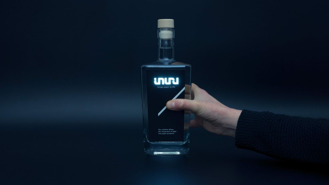
Thin printed OLEDs can be integrated into selected areas of a label, allowing specific shapes and graphics to emit light without requiring the whole surface to illuminate. This gives designers precise control over which visual cue remains active when ambient light becomes limited.
The most useful question is therefore not whether a luxury spirits label can produce its own light. It is whether emission solves a specific visibility or recognition problem that passive materials cannot solve consistently under the intended low-light conditions.
Luxury spirits labels are often designed around subtlety. Fine typography, restrained colour, metallic finishes, texture and carefully controlled contrast can all communicate quality under bright or neutral lighting. Once the bottle enters a darker environment, however, those elements are no longer perceived under the same visual conditions.
The difference begins with human vision itself. As illumination decreases, the eye moves away from fully photopic vision and into the mesopic range, where rods and cones contribute together and spectral sensitivity begins to change. Colours can therefore shift in relative prominence, and technical brightness measured under standard conditions does not always predict exactly how a visual element will be perceived in a dim venue.
For label design, this makes hierarchy especially important. Not every part of the artwork needs to remain equally visible. Fine finishing can continue to reward close inspection, while larger shapes, stronger contrast and distinctive brand cues carry recognition at greater distances or under less predictable lighting.
Materials also behave differently depending on how they interact with light. Metallic foils, glossy varnishes and reflective surfaces can produce sophisticated highlights, but their visibility depends on external illumination and viewing angle. Light-emitting elements offer a different behaviour by allowing a selected feature to remain active independently of ambient light, although colour, brightness and placement still need to be evaluated under realistic conditions.
This is why low-light testing should go beyond dimming the lights in a design studio. The finished bottle should be viewed under different illumination levels and colours, from multiple distances and angles, while stationary and moving, and through a smartphone camera. These tests reveal whether the visual hierarchy survives once the packaging leaves controlled conditions.
For luxury spirits brands, designing for low light does not mean making packaging louder or brighter. It means understanding what happens to perception when the environment changes and deciding which elements need to remain recognisable. When the label is designed around that distinction, premium detailing can remain subtle while the identity of the bottle continues to hold together after the lights go down.
How do luxury spirits labels perform in low light?
Luxury spirits labels can appear significantly different in low-light environments because human vision changes as illumination decreases. Fine detail, subtle colour relationships and low-contrast elements may become harder to perceive, while larger shapes, stronger contrast and clearly prioritised brand cues are more likely to remain recognisable.
What is mesopic vision and why does it matter for packaging?
Mesopic vision is the intermediate range between bright photopic vision and very dark scotopic vision. Both rods and cones contribute to perception in this range, and the eye's sensitivity to different wavelengths changes. This can affect the relative brightness and visibility of colours used on a spirits label.
Why can label colours look different in a dark bar or club?
As illumination decreases, the visual system does not respond equally to all wavelengths. Coloured ambient lighting can further change how the label appears. As a result, colour relationships established under neutral studio lighting may not remain identical in a low-light hospitality environment.
Do metallic finishes work well on luxury spirits labels in low light?
Metallic foils and reflective finishes can create strong highlights when they catch an external light source, but their visibility depends on viewing angle and surrounding illumination. They can remain effective premium details, although they are less predictable as constant recognition cues.
What is the difference between reflective and light-emitting label elements?
Reflective elements depend on external light and redirect some of that light towards the viewer. Light-emitting elements generate their own illumination. This allows an illuminated logo, outline or graphic to remain visible even when ambient lighting is limited, although perceived brightness still depends on colour and viewing conditions.
Can two illuminated colours with the same brightness look different in low light?
Yes. Similar measured luminance does not necessarily mean identical perceived brightness under mesopic conditions. As the spectral sensitivity of the eye changes at lower illumination levels, different wavelengths can appear relatively stronger or weaker.
How should luxury spirits labels be tested for low-light environments?
Testing should use the finished bottle and include different illumination levels, warm and cool light, coloured ambient lighting, several viewing distances, changing angles and movement. Smartphone photography and video should also be included if the bottle is likely to appear in nightlife or event content.
When should a luxury spirits label use illumination?
Illumination is most useful when a specific brand cue needs to remain recognisable despite limited or inconsistent ambient light. It works best when applied selectively to an existing logo, emblem, outline or graphic element rather than used simply to make the entire bottle brighter.
Interested in illuminated labels for premium spirits? Explore how Inuru’s OLED technology can support visibility and brand recognition in low-light environments.
Last updated: August 2026
SOURCES:
(2)https://www.ncbi.nlm.nih.gov/books/NBK11525/
(3)https://www.sciencedirect.com/science/article/abs/pii/S0148296319300360
(4)https://link.springer.com/article/10.1007/s11554-024-01532-7
(5)https://www.sciencedirect.com/science/article/abs/pii/S014829631730142X
(6)https://www.sciencedirect.com/science/article/pii/S0148296322003630
(7)https://www.sciencedirect.com/science/article/abs/pii/S0969698913000040
.svg)


